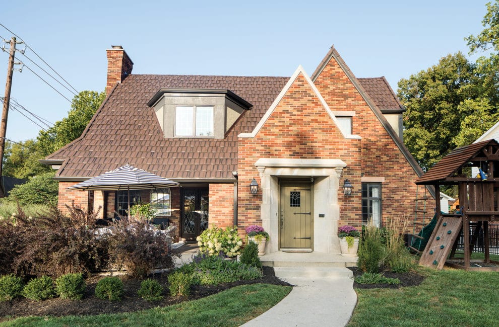
A Dated Old Meridian-Kessler Tudor, Or A Perfect Canvas?

Photo by Tony Valainis
Few people want a house that has remained the same—the exact same—for 40 years. Wish lists don’t tend to include burgundy walls, aqua-colored crown molding, and a 1,400-square-foot attic no one thought to convert into usable, livable space. Yet all of that appealed to Tiffany Skilling, an interior designer, and her husband, Jon. “I wanted a house that was untouched,” she says. “You don’t find a lot of that in Meridian-Kessler anymore. Lots of houses have had several renovations over the years. This was fun to try and keep all the integrity, but update it for us.”
Remarkably, Tiffany and Jon are only the third owners of their 1920s residence. It hadn’t been touched since Jimmy Carter took office, but that also meant it didn’t come with an everyone-and-their-mother-lived-here feel. The couple wasted no time bringing the English Tudor–style home into the 21st century. The day they closed, Tiffany and Jon ripped out a makeshift screened porch out front. “It was a lot,” Tiffany says, referring to the total number of renovations they undertook. “But it was worth it.” Worth the time. Worth the money. Worth having the contractor touch every room. Worth living solely on the first floor for two-and-a-half years.

Carrara marble shows up in the kitchen’s backsplash and behind the range in herringbone, a pattern that gets repeated on the floor. The wooden balusters at the ends of the island were salvaged from a Connecticut mansion; Tiffany found them on Etsy.Photo by Tony Valainis
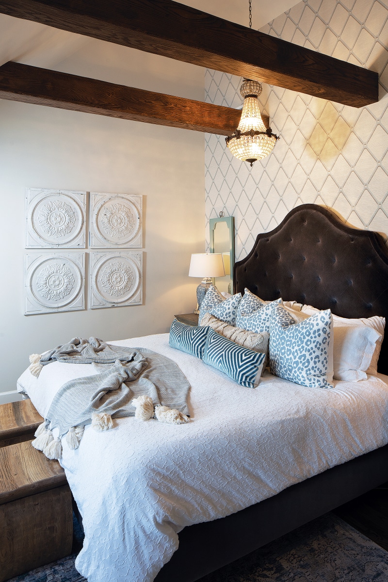
It’s hard to imagine Tiffany, Jon, and their daughter and son all living on the compartmentalized main floor, or that the three-bedroom, two-bath second floor was nothing more than exposed rafters and spiderwebs when they moved in. There wasn’t even a “proper” staircase—just pull-down stairs, like the ones that bested Clark Griswold in Christmas Vacation. Since “real” stairs require more square footage and, thus, careful planning, Tiffany and Jon turned to architect Chris Short of Haus Architecture. He drew up plans for both the first and second floors before the Skillings even closed on the house. “He’s so innovative and really collaborative,” Tiffany says. “He was patient with me, too, because I went through several iterations of ‘I don’t know; I think I want the staircase here.’ And he’s like, ‘Tiffany, no. This is the only way we can get everything we want upstairs’”—a master suite, a Jack and Jill bathroom, and a bedroom for each child.
Since the kids’ bedrooms are roughly the same size, there was no fighting over who has the bigger one. Both children have a cubbyhole, too—a secret room built around the home’s rafters, perfect hiding spots while playing “spies.” Each room also has a gallery wall, one of Skilling’s favorite decorating touches. They display Skilling’s collections throughout the house. “I collected the [oil paintings] over several years, so that gallery wall is really meaningful to me,” says Tiffany. “It was really fun to find all of the pieces, and so worth the wait. I always tell people that there’s so much beauty in the wait.”

The den (above) used to be a bedroom, before the Skillings moved in and made the second floor livable. Pops of fuchsia, like in the pillows and flowers, pick up others in the nearby living room. Matching archway entrances also tie the two spaces together. “There’s something new in the house every week, and my husband just shakes his head at me,” says Tiffany. “The one thing he paused at was, ‘Really? We’re getting a white couch?’ But it’s Ikea, and I wash it. There has been many a ketchup and wine stain on it, so I just remove the slipcover and wash it, and it’s fine.”Photo by Tony Valainis
Artwork doesn’t have to come in frames or on canvas, though. Sometimes, it’s an architectural feature, like an incinerator the Skillings transformed into a drawer for keys and sunglasses, or an old telephone box they turned into a charging station for iPads. It’s the exposed brick in the kitchen that spells out the name of a brick manufacturer in Indianapolis. And the crown molding—most of it original, and none of it aqua-colored—that caps the walls. The original French doors remain intact, along with the limestone fireplace and archways, doors, and doorknobs.
The historical features complement Tiffany’s modern sense of style, which includes a fuchsia ottoman from Wayfair, pattern mixing, gold light fixtures, CR Laine swivel chairs, and lots of blue, her favorite color. “Don’t think that just because a home is a certain architectural style that you can only purchase art and furnishings that would be expected in that space,” Tiffany advises. “Part of what makes a house a home are those special details.” Think of it as buying an old house and putting a new house inside it.


