Six Things We Love About Our Airport That Conde Nast Traveler Left Out
Conde Nast Traveler readers just voted Indianapolis International Airport their favorite terminal in the country, citing local restaurants and Civic Plaza’s Midwestern characteristics (meaning neutrality, symmetry, and friendliness). That’s nice praise, but not enough for an airport that doesn’t make you squirm to get out of there. Now, as airports get ready for their busiest days of the year this week, we rounded up six subtleties and secrets that make us arrive early for a flight at IND.
1. The light well. Next time you’re in the baggage-claim level, notice how bright it is. This is partly due to an architectural feature called a “light well.” This conduit of natural light is an open space along the front wall that extends up to the departure level.
2. The views. You can see outdoors from every spot in the airport. Except the bathrooms.
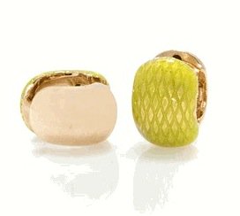
3. The Erwin Pearl store. Located in Concourse A, this fine jeweler has two shops on Madison Avenue in New York City. The brand sells reversible clip-on earrings called Hugs (pictured) that also have a patented comfortable closure. This fall, it released a line of Van Gogh silk scarves approved by the artist’s museum in the Netherlands.
4. The crowd. The airport reminds you how big Indianapolis is. There’s a weird feeling when you emerge from the jetway after landing: You’re home, but everyone’s a stranger. Nowhere else in the city does it occur to us how many people we still haven’t met yet.
5. The invisible hand. Travelers never really have to look for signage telling them where to go. The intuitive design and purposeful use of natural light guide them though the space naturally.
6. “Ahhh, freak out!” Those lights in the bridge to the parking lot never get old.
But no airport is perfect. A few things that bug us:
1. The concourse names. When you enter Civic Plaza from the ticketing hall, shouldn’t Concourse A be on the left and Concourse B on the right? This throws us every time.
2. The bearded one. Andrew Luck looks awfully uncomfortable in that massive Klipsch advertisement at Concourse A’s Civic Plaza exit.
3. The pedigree. The terminal was designed by a Texas architecture firm. It’d be nice to see local companies win these major commissions.


