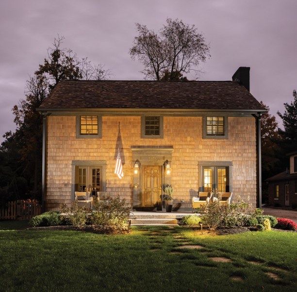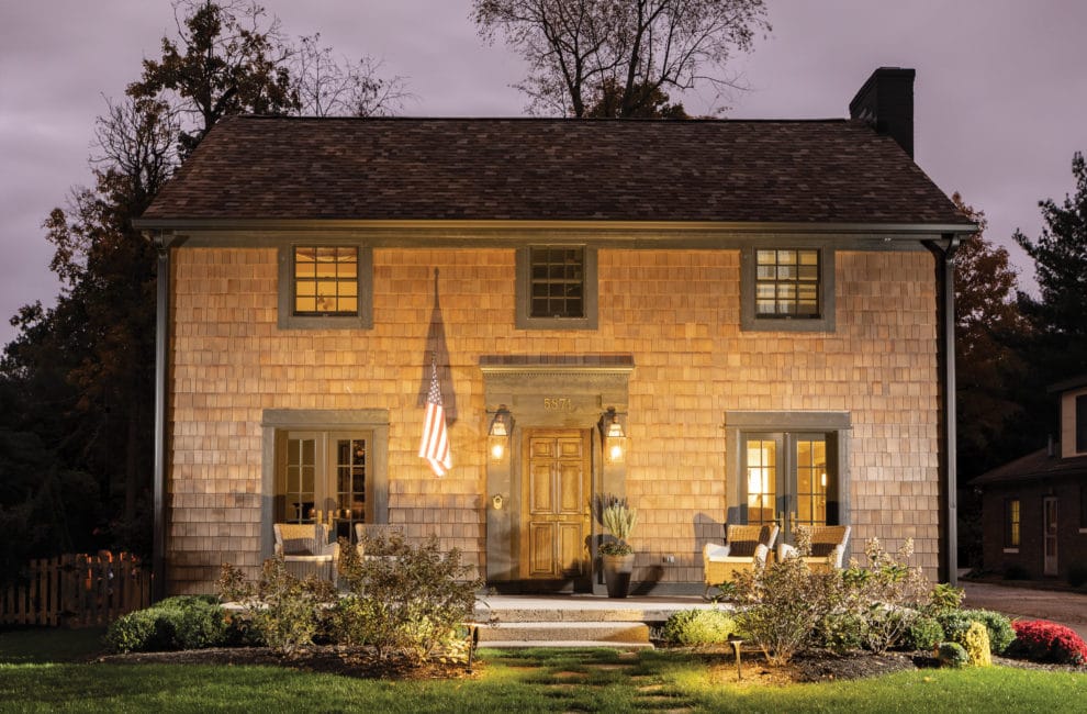
Designer Becky Morrison’s stylish Forest Hills redo includes cedar-shake shingles. Photo by Tony Valanis
Classic Meets Chic At This Forest Hills Home

The dining room chandelier is made of porcupine quills.Photo by Tony Valainis
If you have the right eye, you can find some true gems on Facebook Marketplace. Interior designer Becky Morrison spotted her family’s next house among the endless rows of drab amateur snapshots—a character-rich Colonial in their beloved Meridian-Kessler with the large lot they were hunting for, plus an outdated look that would let Morrison and her husband, Mike, rework the inside and out to their taste.
For them, a full-scale renovation is fun. “The big challenge of design is to figure how clients use their space,” says Morrison, owner of Lynn & Campbell decorating firm. “When you design for your family, that’s figured out already.”
The other challenge in this house, like many old homes, is being creative with storage. “The space isn’t always where you expect it to be,” she says.
Morrison reclaimed functional pockets that others might have overlooked. For instance, in one daughter’s bedroom, a shoulder-height niche pushes deep into a wall where attic access used to be. The ladder to the girl’s bunk bed can easily be moved a few feet over to the niche for climbing in and retrieving things. For a tight spot next to the new back staircase, Morrison had a carpenter whip up a custom wall-mounted shoe rack where lesser imaginations might have plopped or hung hooks. She also added a laundry chute from the upstairs bedrooms to the new laundry room.
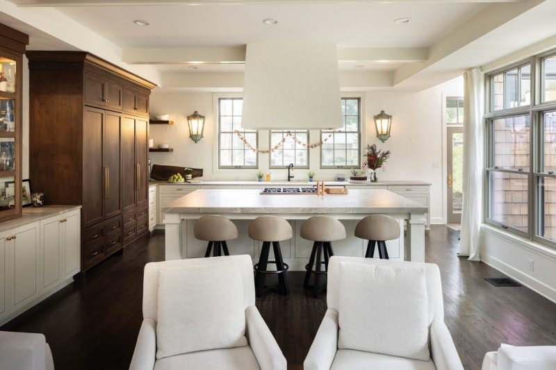
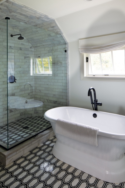
Cleverness goes only so far. The obvious answer to limited space is to add on. Working with Timothy Homes and Rottmann Collier Architects, the Morrisons doubled the square footage with an addition off the back. The space houses a relocated and enlarged kitchen, an adjacent great room, a three-car attached garage and an in-law suite above it, and a main bedroom suite with an adjoined sitting porch. Now 4,000 square feet, the layout fits five bedrooms and three-and-a-half baths.

The custom alder-wood kitchen cabinet, a substitute for a pantry, she smartly made sure that open doors can slide back into the unit so they don’t look messy.Photo by Tony Valainis
Despite the numbers, the house doesn’t feel huge. There are no wasted areas, no yawning hallways or out-of-scale transitions to detract from the cozy warmth. The entry feels semi-formal, opening into a foyer with the staircase and rooms on each side. One room has a piano on a cowhide rug as a focal point, a gift from a past neighbor who was moving at the same time the Morrisons did. The other goes to the dining room and the rest of the main floor. A hallway off the dining room leads to the former kitchen turned into a laundry room and a half bath, while straight ahead, the addition begins with the great room that flows into the kitchen.
Upstairs, sisters who used to share a room now have their own bedrooms, but Morrison added a pass-through in their back-to-back closets to make it feel like they are still together.
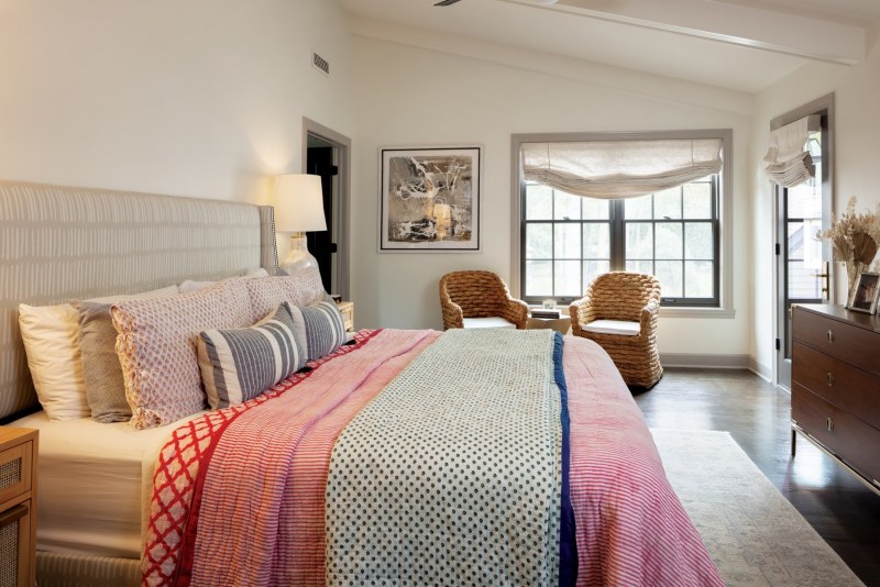
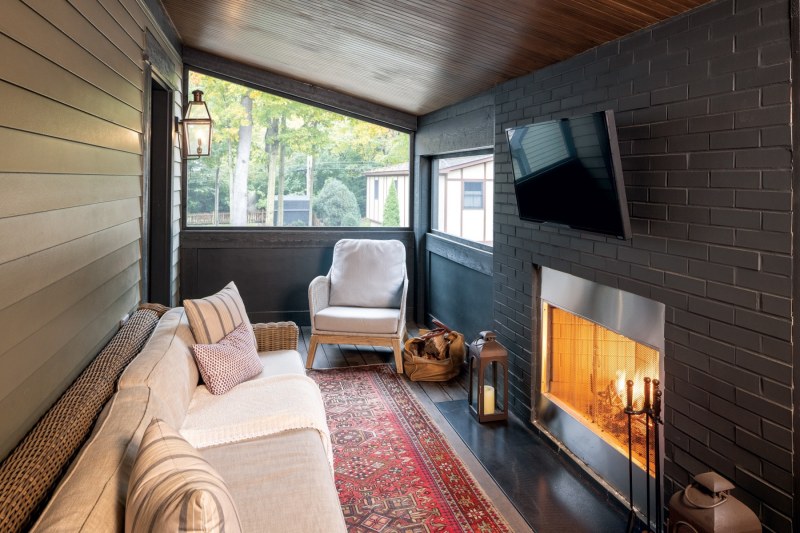
Three wide steps lead to the main suite. This feature wasn’t planned—it became necessary to fix a problem in the kitchen remodel directly below. But it worked out for the best. The high, double-door entrance distinguishes the parents’ suite as special and emphasizes the separation from the rest of the floor. Inside, the decor feels cozy with oversized contemporary lamps, beamed ceilings, and a partially screened-in porch with a fireplace functioning as a private TV room.
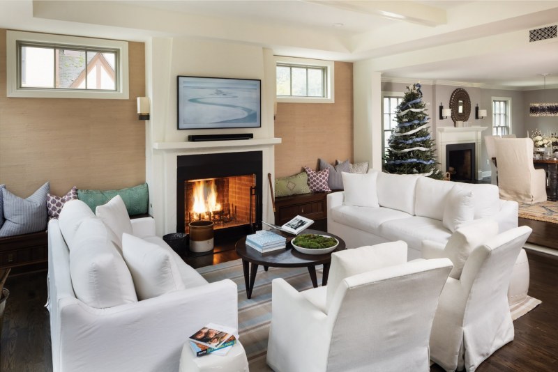
With three kids at home, it’s hard to believe that Morrison went all white with the great room’s overstuffed couches. But she doesn’t bat an eye. It’s a washable fabric by Lee Industries, a line she uses as an interior designer, and the chair upholstery simply wipes clean. “I wouldn’t sell it if I couldn’t put it in my own home,” she says. And the space has definitely been tested with spaghetti sauce and markers. The children wake up early and ask their parents to light a fire in the room and hang out until school time, which starts a bit late where they go.
Though the house is family-forward in its function and feeling, there’s an undeniable chicness, too, that Morrison has blended in effortlessly. It’s in the statement lighting—the dining room pendant is made of porcupine quills, each a lacquered gradient of cream and black. It’s in the oversized photograph on the dining room wall, a Florida beach where they vacation, bringing in a pop of contemporary color. It’s in the sueded finish of the quartzite countertop, and in the custom-designed kitchen pantry cabinet whose doors slide back inside and disappear so they don’t stay open and create visual clutter while entertaining. It’s in the layering of a vintage runner over a natural-fiber area rug. It’s the polish of a professional that you can’t find on Facebook Marketplace.

