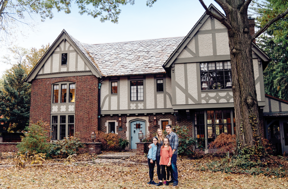
Fair Oaks wasn't love at first sight for the Colbys. After the first walkthrough, they weren't yet sold. Family photo by Leah Tribbett
A Meridian-Kessler Home’s Blue Beginnings

Designer Tiffany Skilling wove family history into this remodel by using a bureau and china inherited by its owners as inspiration.Photos by Ashlee Kindred
When French Country was a reigning interior design style in the early aughts, no one did it better in Indianapolis than Cherri Colby. The owner of Colby Antiques and Interiors and a high-end decorator for many years, she had a special place in her heart for the color blue, a signature of the look. When she passed away in 2008, her son, Nick Colby, inherited many of her beautiful heirlooms. Then they became the starting point for a dramatic renovation of an English Tudor named Fair Oaks in Meridian-Kessler.
Nick and his wife, Kelly, hired designer Tiffany Skilling—Kelly’s boss—whose job was to modernize the home for the family of four, preserve its charms and original architecture, and weave Colby’s cherished china and antiques into a style that reflected Nick and Kelly’s taste. The finished product is a stylish finessing of old and new that feels original and one-of-a-kind.
While the home is unquestionably pulled together, one of Skilling’s secrets is to not take design so seriously. “Design doesn’t have to be stuffy,” she says. “It’s just really fun when people walk into a room and don’t even know why they like it so much. That’s when it’s good design.”
This was a partnership from the beginning. Skilling accompanied the couple on showings when they were house-hunting in Meridian-Kessler, where the Colbys were already living. Nick was once president of the neighborhood association, and Skilling both lives there and concentrates her work in the venerable area. Fair Oaks had been empty for two years, but all three of them saw the potential in the wide Norman arches, the foyer’s barrel ceiling, plaster walls, terrazzo floors, and an elaborately painted ceiling in the living room. But there were too many rooms for modern living, and once the renovation started, the terrazzo floors became a casualty of the process. The basement was too small to run new mechanicals through it, so the only way to install them was to rip up the floors.

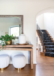
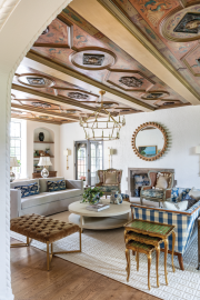
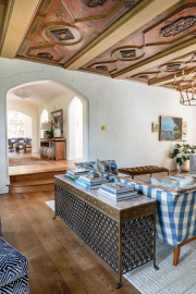
When fine artist (and neighbor) Greta Krueger restored the ornate painted ceiling, she made a fun discovery: The beams are plaster, not wood. The sofa table was born from an old radiator grate. Throughout the home, existing architectural designs were repeated in the new design.
On the plus side, architect Mark Demerly made sure to repeat existing architectural details in the new floor plan. The team, which included general contractor Rob Bennett of Bly Bennett, found a plaster artisan who could repair the various style of applications throughout the home. Then Skilling painted it all white. “Plaster can be very harsh,” she says. “I like for the furniture and artwork to be what’s talking in the room.”
In a stroke of serendipity, the Colbys’ new neighbor, fine artist Greta Krueger, was just the person to save the living room’s grand painted ceiling—she had studied the restoration and gilding of architectural objects in Italy. Rather than decorating the room sparely to let the ceiling have all the glory, Skilling filled it with an eclectic mix of furniture and artwork to help bring the eye down and “ground” the space. “So you aren’t just looking up at a dark ceiling,” she says. She started with Cherri Colby’s blue-and-white-checked sofa and added cane wingback chairs for another touch of French Country. Modern elements include an upholstered bench with metallic legs, a streamlined sofa and chandelier, chunky open shelving, and a monolithic coffee table in shagreen, a pebbled, faux-leather surface. Gold wall sconces bring in some elegance, and blue-and-white fabrics from Schumacher include an animal motif, a floral, and a geometric.
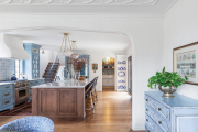
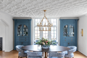
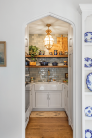
An antique blue bureau took an unexpected place in the dining room instead of a bedroom and inspired the soft colors of the custom cabinetry there and in the adjacent kitchen by Nathan Alan Fine Cabinetry and Design. Skilling likes reflective elements in design, so she mirrored some of the cabinet doors. Cherri Colby’s blue-and-white china collection is on display in a plate rack with brass rails. A sophisticated eye might notice that the blue-and-white backsplash tile mirrors the moldings on the dining room ceiling, and that both the dining room’s sconces and pendants over the kitchen island are alabaster. Skilling chose a curvy Venetian plaster hood, but didn’t burnish it to look like the walls, opting for a contemporary matte finish instead.

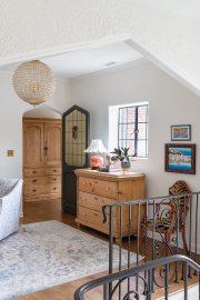
Skilling always wants to make a home’s private quarters an oasis with special touches, like the wall sconces and picture moldings. The arched entries here are new, but echo the Norman arches downstairs.
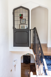
Upstairs, she went for more drama in bathrooms and bedrooms, and a little quirk. Originally, a pair of doors with leaded stained-glass details were at the top of the stairway, an odd configuration. Both were restored, and one was left in place, now to the side of the stairs. The other was moved to another room.
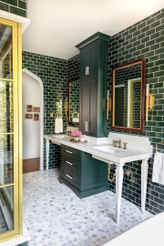
Vintage Meridian-Kessler homes also tend to have some Rookwood tile, so Skilling tiled the bathroom in the owners’ suite floor to ceiling with the company’s shimmery, dark-green “Nebula Glaze.” It’s so stunning that Rookwood uses a photo of the bathroom on its website. The new Kohler clawfoot tub and marble hardware have a throwback feel, while the gold starburst chandelier adds some glam. “It’s 2021, not 1921,” Kelly says. The room was designed around a pair of antique mirrors that she and Skilling found in Louisville on a shopping trip.
Fair Oaks wasn’t love at first sight for the Colbys. After the first walkthrough, they weren’t yet sold. But it was on a block of Washington Boulevard that they love, and Skilling and Bennett helped them see the potential in its architectural details—down to rope details on both old radiator covers and the Norman arches, making the couple wonder if the metalworker who made the radiators collaborated with the architect long ago. “They just don’t build houses like this anymore,” Kelly says. But sometimes the perfect people to save one come along, out of the blue.

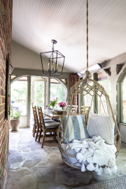
The screened porch and its copper roof we rebuilt but the floors are original. The owners didn’t think they would use it very much, but they do.

