Bright, Bold, and Unusual in Carmel
Matt Heincker is not afraid to mix things up in his own home. The Carmel-based interior designer transformed his circa-1970s pad into a contemporary masterpiece, showcasing period pieces with classic modern furnishings. He pulls in a fun and bright palette of color, proving that a coordinated design doesn’t have to resemble a 1990s wedding party. Floral prints can live with geometric patterns. Bold artwork can share the space with subtle accessories. Pricey pieces can coexist with castoffs—assuming the latter get a little Heincker love and inspiration.
“It’s all about mixing super classic and super contemporary pieces,” says Heincker, who also pens a monthly “Modern Home” column in The Indianapolis Star.
Let’s be honest. For some of us, mixing classic and contemporary would result in an uncoordinated mess resembling your first apartment with your roommate’s old couch, grandma’s antiques, and that one department-store table you splurged on. But Heincker understands the limits and the potential of such a plan, and the tactic creates a high-end yet comfortable vibe in the home he shares with his wife, Stephanie, 4-year-old son, Levi, and 2-year-old daughter, Olivia.
Palette Perfection
Heincker’s living room reflects a cool combination of grays, blues, charcoals, and white, with punches of brighter colors acting like exclamation points in his design statement. He could have gone with a warmer combination of browns and reds, and that would have worked, too, but he says to stay away from trying to cram both into a room.
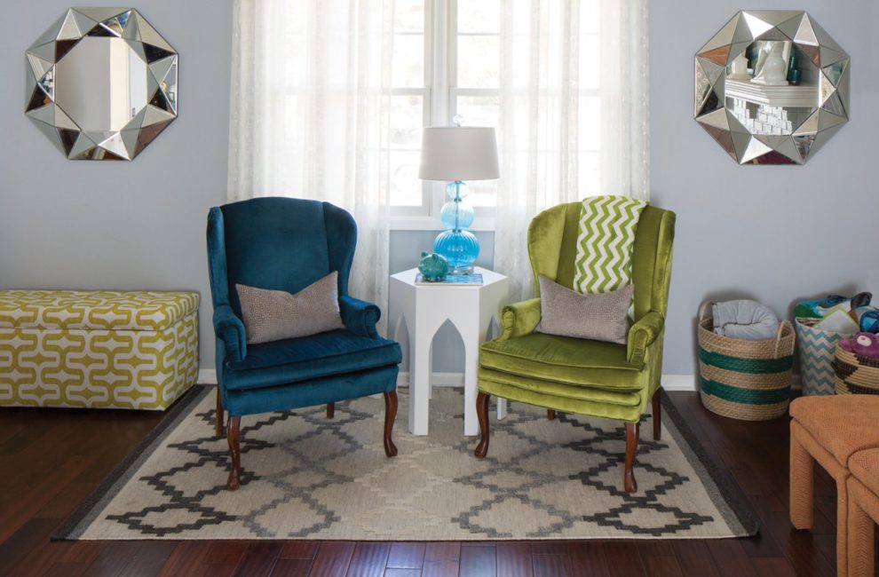
“To mix color, you first need to decide if you’re cool or warm,” Heincker says. Let one or two pieces inspire the chosen hues. Heincker has an abstract print above his fireplace, a tiled design of watery blues and smoky grays interspersed with yellows, greens, and oranges. The color combination pops out around the room, like on the recovered pair of vintage wingback chairs in blue and green and the brown leather Chesterfield sofa with vibrant throw pillows.

The master bedroom started out fairly traditional, but Heincker infused it with his style by adding antique furniture painted gold and a yellow settee from the ‘70s he didn’t even have to tweak.
The same idea shaped Olivia’s room. Heincker started with colorful Cole & Son wallpaper in a digital butterfly print on one wall, inspiring the wall color, the artwork, and the fabric on the big girl bed’s headboard.
Blank Canvas
Heincker’s living room walls wear a coat of Sherwin-Williams Stonewall Jackson paint, creating a quiet but strong backdrop for his design. Geometric area rugs work together and complement the other patterns in the room, like the chevron throw and the animal-print pillow. Hardwood floors of durable hand-scraped tuan offer a sturdy backdrop.
“If you have a neutral foundation in a room, you can fearlessly mix prints,” Heincker says.
Stephanie brought a green Turkish rug into the marriage, which found a home in the master bedroom. What could Heincker do with a dark green that had little in common with the soft hues of the lower level? He magnified it by painting the master bedroom walls a matching deep green. Everything else is black, white, or yellow, including the artwork, trim, and an unexpected punch from the sunny vintage loveseat.
“The room can handle color because everything else is neutral,” Heincker explains.
Mix It Up
Heincker’s family eats their meals at a white Saarinen Table by Knoll. A set of 1960s cane-backed chairs Heincker saved from the trash—and fondly refers to as his “Golden Girl chairs”—surround the sleek dining table.

Even the home office pulls together unique pieces, such as this desk—originally a dining table—from West Elm and a vintage chair Heincker found at Midland.
“We were bringing my daughter home from the hospital, and I saw these chairs by the side of the road, and I had to get them,” Heincker recalls. “My wife was like, What are you doing?”
Blending trash with treasure takes work, though. Heincker stripped down the chairs and spray-painted them with metallic lacquer. Then he added colorful fabric to the chair backs, resulting in a cheerful addition to the family space.
Stephanie’s Greek roots inspired the couple’s lively guest room. Heincker opted for a bright-yellow printed wallpaper, which casts a golden glow on the bed, covered in blues, creams, and reds. Framed travel prints accent the ambience. A desk that used to belong to Stephanie’s grandfather now doubles as a vanity with a Moroccan mirror placed above it.
Using a mix of high- and low-end items keeps Heincker’s home from looking like a thrift-store display. The living-room bookshelf combines white Jonathan Adler accessories with Target pieces. The sitting area works because the Chesterfield leather sofa sets the tone for a space that includes vintage chairs and a mid-century modern coffee table.
There’s no need to settle for all traditional or all contemporary, Heincker says. Enjoy them both in the right combination.
“Make sure the ratio is one to one,” Heincker says. “Have equal amounts of both in a room and watch it come to life.”

This article appeared in Indianapolis Monthly Home, a 2016 special publication.


