Home Of The Month: Clean Living
Among a row of gingerbread-trimmed cottages in Fletcher Place sits a narrow new build full of right angles and squares. The modern design is intentional and bold, especially for this quaint little street where most homes date from 1857 to 1930. The owner, Joe Shoemaker, a graphic designer turned real-estate agent, and One 10 Studio sketched a home with design as the driving factor, inside and out.
Shoemaker is known for listing the city’s best midcentury-modern houses, but he wanted his own abode to be the display room for his artwork and furniture. “If I could live in an art gallery, I would,” he says.
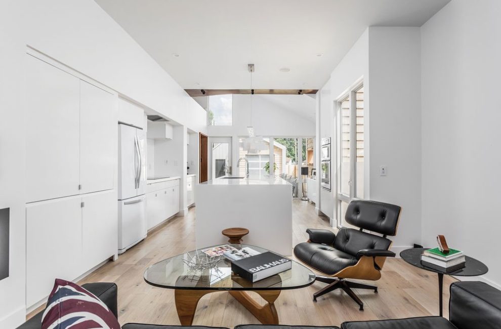
This 1,500-square-foot home comes pretty close. The first level is stark, but not cold. Floor-to-ceiling windows take up most of the back wall space, and natural light warms white walls in the kitchen and hearth area. The windows meet warm white oak floors. The center of the kitchen is a nine-and-a-half-foot Corian stone island with a steel frame and waterfall edges. Oak covers one side of the base, up to the countertop. A long and narrow light fixture with a spaceship-y, futuristic feel hangs above. In place of the expected stainless-steel appliances, white ones with stainless-steel handles continue the monochromatic color scheme. A splurge, an induction cooktop, sits in pristine condition, because this busy professional doesn’t like to cook. Shoemaker puts more mileage instead on a sweet little coffee nook leading into a small dining area beyond the kitchen, defined by an origami-shaped chandelier.
Most of the space is multi-purpose now that Shoemaker, a father, is an empty-nester and has no use for a traditional floor plan. A space off the hearth room functions as an office, den, and guest quarters. Its vaulted ceiling allows for that show-stopping angle on the front of the house. One wall is rough, exposed brick—Shoemaker leans toward the use of raw materials when he can. On the opposite side of the house, where the kitchen breaks into the dining nook, he wrapped a metal structural beam overhead in beautiful walnut. The entryway walls carry through this raw look with Indiana walnut, an ode to his grandfather, who always had wooden objects in his home made from trees on his Hoosier farm.
Parallam wood stairs lead up to the master bath and bedroom, the only spaces on the second level. Beyond the his-and-hers sinks in the master bath stands one big room with ceramic tile covering the floors and walls. Three showerheads are mounted on a tile wall in the middle of the room. There is no enclosure, only a slightly sloped floor so water drains, and tile sealed by a Wedi waterproofing system. The wide-open design was influenced by spas Shoemaker and his girlfriend have visited. The openness is definitely a love-it-or-hate-it feature—you’re either going to feel naked and exposed, or free and European.
The basement has the opposite effect: a cocooning feel. Here, the house literally turns from light to dark. With charcoal-gray wood floors and walls, the lower level doubles as a guest suite and a rec room where Shoemaker can jam on his guitar. Or, really, whatever he is feeling at the moment. The bathroom here has a steam shower with a black honed-granite seat and threshold, and dark-gray ceramic tile that looks like sparkly felt. It’s 950 square feet of a little bit Vegas and a little bit man cave.

Shoemaker may not live in one of the midcentury-modern homes he often lists for clients, but his appreciation for
the style is evident in the spare furnishings. Both the wire kitchen stools and the colorful molded-plastic dining chairs (below and right) represent classic designs from the era.
Shoemaker waxes poetic about the hundreds of tiny (but expensive) decisions he made to change the quality of his home. He ended up spending a good chunk more than he anticipated, but doesn’t regret it. Some of those costs went to the floor-to-ceiling tile in the master bath, commercial-grade metal on the exterior, and those walls without baseboards, which must line up perfectly with the floor when there’s no trim to hide flaws.
In the same breath, he describes his home as “minimalist extravagant.” “It doesn’t have to mean expensive,” he says. “A hunk of walnut is luscious. A cast-iron piece is luscious.”
It may seem kind of high-brow to some, but Shoemaker is an artist at heart, so his obsession with having meaning behind his design decisions makes sense. But not to everyone. At least one of his neighbors expressed his displeasure by driving through wet concrete during construction.
Fletcher Place is largely made up of Holy Rosary, Indy’s original Italian neighborhood and home of the popular Italian Street Festival. It’s notoriously tight-knit, with homes often passed down from family to family. This lot was hard to come by, like most parcels or houses in the downtown neighborhood to the south of hip Virginia Avenue. Shoemaker scored his property by writing letters to the owners of several vacant lots that were not currently for sale, offering to buy.
While Shoemaker’s home stands out to most people, the design did factor in the area’s prevailing architecture. The covered porch has an intentional whiff of nostalgia, and cedar cladding on the exterior was intended to fit into the neighborhood “fabric,” say the architects. But there’s no question the house attracts attention. And while Shoemaker says there’s a demand for open-concept, family-friendly homes downtown, his may not be the template. Perhaps with a vision to live in an art gallery, Shoemaker created a one-of-a-kind avant-garde masterpiece.


