A 2018 addition by local architect Steven Risting mirrors the post-and-beam construction of the original. Tony Valainis
Home Of The Month: Gesamtkunstwerk
“I’m an old man,” Helmut Fortense says. “I have to recognize that. I’ve done my thing in this community. I’m ready to do the final stages of my life.”
He’s not old, actually. Fortense is 77 and in good health. But if there’s anything the German-born businessman has mastered, it’s how to live well. There are operas in Europe to see—he and his wife, Katie, recently attended two performances in Bayreuth, Germany, after waiting four years for tickets. There are books to read and music to make—the couple just built a glass pavilion at their home for such refined pursuits. There are fine cars to look at—Fortense had a successful career as the owner of a Mercedes dealership in Illinois before retiring at 50 and moving to Indianapolis.
But there is no more furniture or artwork to sell.

“The first thing you need is a comfortable dining chair that doesn’t remind you to get up,” he says. He avoids ubiquitous iconic pieces, which can add up to a sterile environment. Table, 1950s Molino. Chairs, B&B Italia. Chandelier, 1960s German. White marble lamp, Carlo Scarpa. Sculpture, Terre Haute native Charlie Gibson.Tony Valainis
Fortense will walk away from his store, Form + Function, at the end of the month. At press time, he didn’t plan to sell it, but instead is holding a closing sale through December. His inventory is large and expensive, most of it European, representing the latest and best of modern design, as well as classic pieces from the likes of Eames, Le Corbusier, Alvar Aalto, and Michael Graves. To deal in this aesthetic in Indianapolis, where tastes run conservative and most new architecture takes its cues from the past, one must live and breathe not only the look, but the lifestyle.
“Helmut was a pied piper of modern design in Indianapolis,” says interior designer Tom Vriesman, a friend and colleague who often attended the Milan Furniture Fair in Italy with Fortense. “When Craig Miller was building the contemporary design collection at the IMA, Helmut partnered with him to get pieces donated.” Fortense also hosted events at the store for the museum’s Design Arts Society, nurtured local artists, and converted the curious into Modernists over cups of espresso and discussions about the sophistication of modern design.
Fortense moved to Indy after spending a couple decades in Illinois. By the early 1990s, having divorced, he was soul-searching with a local disciple of the mythopoetic men’s movement, based largely on the book Iron John: A Book About Men, by Robert Bly. Indy was also closer to his son, who was in college in Ohio. Fortense had to do something, and he always appreciated modern design, though he had never trained in it. So he opened Form + Function and—in what he now calls “a massive miscalculation”—thought it would be easy to sell sleek European home accessories here.
One early customer was wary at first. He came into the store when it was located at what is now Ironworks, near the bygone George’s restaurant. It wasn’t the best location—Form + Function faced the fast-moving traffic on Keystone. To catch attention, Fortense placed two red lamps in the window and left them on all night. “Red attracts unmarried men,” Fortense says, laughing and half-joking. But it worked. That early customer was a doctor in the throes of a divorce. He looked around and bought a lamp. Later, he returned and asked for design help at his house. Fortense himself handled such duties at the time. The man began buying Form + Function’s pedigreed furniture, which, Fortense says, meant nothing to him the first time he had come to the store. Fifteen years after that visit, he hired Evans Woollen to create a boxy Modernist home—and convinced two friends to do the same thing next door. Fortense’s work was done.

In the foyer, the Bauhaus-era Kandinsky cradle by Peter Keler holds yoga mats. The portrait above it is by Indianapolis artist Joe Cancilla.Tony Valainis
He’s a talented businessman, according to architect Drew White, who designed both Form + Function stores (it moved down 86th Street to Nora in 1999). White, also a Modernist, was a kindred spirit. But with kids at home, Form + Function wasn’t always in his budget. Once, White was ogling Le Corbusier’s famous LC4 chaise lounger. Fortense put it in White’s convertible and said to take it home, try it out. “He knew what he was doing,” White says. “As soon as I got it home, I knew there was no way I would take it back. He allowed me to do a payment plan.”
Fortense was making a furniture delivery in the Traders Point area when he found his soulmate of a house: a 1,500-square-foot midcentury modern by Indianapolis architect Edward Pierre, who is well regarded among the local design community but generally considered unsung. It sits on the edge of a ravine, shrouded in trees. It’s petite but special. The living room has a slanted ceiling with exposed beams and a stone fireplace. Doors lead to a patio with total privacy, the owner’s favorite spot to sit with coffee and The New York Times.
A couple years ago, when Fortense got married, he realized he needed more space. Katie plays the cello, and they both like to listen to classical music and read. But the house had only one general living space. They needed an additional room for the times they didn’t want to do the same thing, and they also wanted a guest bedroom.

The kitchen of the 1955 home.Tony Valainis
Fortense hired Steven Risting, a longtime commercial architect in town. Since starting his own practice a few years earlier, Risting has more freedom to take small, residential projects—and this one was special. “I liked that it was an architect-designed house,” Risting says. “I’d done additions to historic projects”—and renovations on the Harry Weese ice-skating arena in Columbus, Indiana—“and was used to exposed timber construction. I’m sensitive to that.” Risting would even go on to win the Edward D. Pierre Award for community service from the Indiana chapter of the American Institute of Architects.
He and Fortense hit it off. Risting spoke Fortense’s language. He had studied in Helsinki as an undergrad and had bought gifts at Form + Function for many years. An Aalto vase was a go-to; Fortense has a big collection of Aalto himself. Risting was currently building his family a vacation home called the Glass Cabin, a pared-down box on posts and ringed with windows in a field, straight out of Dwell magazine. Its living room was much like Fortense’s: a slanted roof with exposed beams and generous views of nature.
They ruled out an addition off the north side of the house that would have required overhauling the septic system. Expanding on the west end would have meant replacing Fortense’s beloved patio. The east edge was the driveway. That left the south—the ravine.

A 1955 home by architect Edward Pierre sets the stage for Helmut Fortense’s Minimalist lifestyle. It’s hard to distinguish between the original section of the house on the left and the addition on the right.Exterior photo courtesy Steven Risting, atelierRISTING
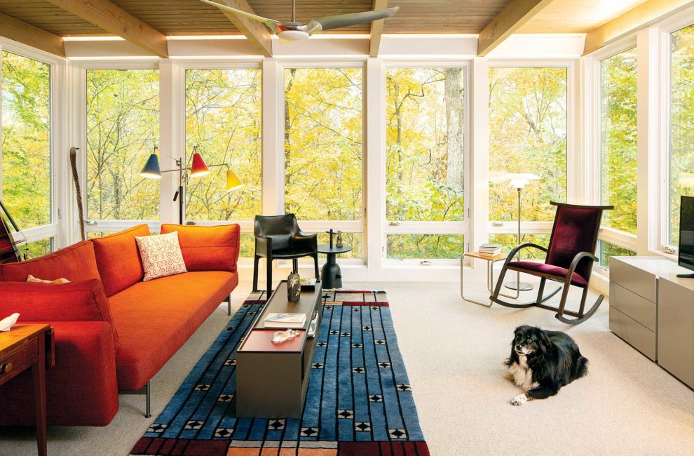
They decided to riff off the Glass Cabin and create a room with windows on two walls and cantilevered over the chasm. The roof was set a little higher than the house’s. A pair of oversized doors fold open from the entryway; the rest of the house spreads out in the other direction, giving this room privacy (with a B&B Italia sleeper sofa, it doubles as a guest bedroom). The higher roofline visually sets it apart from the main house, so the room became known as the Pavilion, an architecture term for a structure with a secondary use in relation to the main one.
It was not easy to build. The room is 16 feet long on a 12-foot-long foundation, requiring four feet of it to hang off the edge. There’s also a “slot window”—tall and narrow—on the one exterior wall that isn’t all glass. Risting went through several contractors before finding someone willing to build it.
That’s the kind of commitment Fortense has to design. “To design a home does not require an architect,” Risting says. “What’s the value? Uniqueness. Most wouldn’t have created the slot window, raised the roof, or cantilevered the room out. They would have built straight down.”
Inside, Fortense has always held fast to the same standard. “I’d rather sit on an orange crate than buy a chair I don’t like,” he says. “I wait until I have the money to buy a chair.” Marriage, though, brought compromises. Katie hung Acopian BirdSavers—a deterrent, also called Zen wind curtains—outside one large window. She made them herself from parachute cords. “If you ever wanted proof that I love this woman,” Fortense says, pointing to them.

Artwork, Spanish. Sculpture, Matteo Lo Greco.Tony Valainis
The house is filled with European designers, but there aren’t any ubiquitous pieces like an Eames lounger or Noguchi table. Instead, a velvet-upholstered Knoll rocking chair by a Spanish designer and a slim DeSede brown-leather armchair see the most use in the Pavilion. (The leather comes from German and Swiss cows raised at high altitude, which makes the hide thicker.) Fortense points to a Bauhaus-era Marcel Breuer “Laccio” side table with simple slab of American cypress wood on a tubular chrome base, one of 200 made in a limited 1994 run. The design, which has endured since the 1920s, was modified from a stool that airplane assemblers fashioned for themselves in the 1920s. You wouldn’t notice it, but to Fortense, its simplicity is beautiful. “Take anything away and it’s no longer a piece of furniture,” he says.

In the serene living room: Brown chairs, ClassiCon. Orange chairs, Poltrona Frau. Side table, Eero Saarinen.Tony Valainis
He doesn’t have a favorite possession. He loves it all—the quality silverware he bought when he was 20 years old and still uses, the Paolo Soleri windchime, the Italian toilet paper holder, the Molino dining room table (an original auctioned for $3.5 million 10 years ago, at the time the most expensive piece of furniture ever sold). That’s where the Gesamtkunstwerk comes in. It’s not about a look; it’s about everything working in harmony (but not because a color palette ties it all together) and creating a feeling of a loved space. The two-room apartment Fortense grew up in in Germany was a Gesamtkunstwerk, even though it didn’t even have a full bathroom. “The rooms had soul, and that was my mother. They reflected her,” he says. Once, on vacation in Costa Rica with his son, a guide invited them to his house. It had a dirt floor and was cluttered beyond Fortense’s taste, but “nothing in it was cheap,” he says. “It was lived in. It was a Gesamtkunstwerk.”
What now, then? What becomes of his self-described “missionary-like zeal” to spread the gospel of Modernism? Can he just sit? Totally relaxed in his lean leather armchair in his pavilion, legs crossed, espresso brewed, Katie nearby with her sheet music, he says, “I have lived the American dream. I can sit.”


