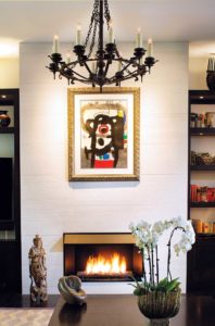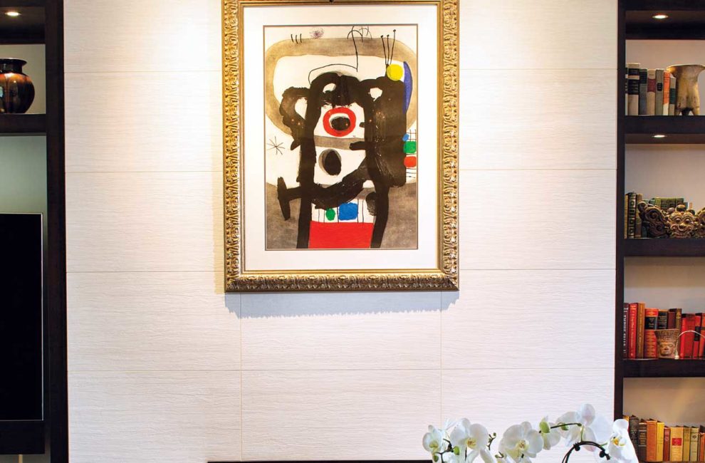
A basic fireplace mantel that had jutted into the living room came down, removing visual clutter along with the keys and knick-knacks it attracted. The Joan Miró hanging above it shines more now, anyway. Photography by Tony Valainis
Home Of The Month: Reframed
The tasteful four-bedroom home in Zionsville was always meant to be temporary. It was a stopping-off point when Marc Gerdisch moved from Chicago in 2006 for a new job, 10 months ahead of his wife, Lori Ann, and their two young boys. Clad in classic red brick and with a spacious yard, it would work. For the moment.
“Then I just became insanely busy,” recalls Marc Gerdisch, a cardiothoracic surgeon. “We all were busy.” The years ticked by, and eventually, they were facing a dilemma that any viewer who’s ever gotten sucked into an episode of HGTV’s Love It or List It can understand: a house that no longer worked for them, conveniently located in a neighborhood they knew and loved. Should they abandon the whole situation and take a chance on building somewhere else? Or make do?
“We loved where we were,” says Marc. “We didn’t like what we were living in.”
What they were living in was a traditional two-story of the sort found in suburbs everywhere. The Gerdisches had, in fact, spent years in a not totally dissimilar home while living in Hinsdale, a suburb of Chicago, before decamping to a more modern condo on Michigan Avenue for a stint. They found they preferred the condo. As they were gradually deciding to stay put in Zionsville’s Stonegate neighborhood, they described their memories of dwellings past to interior designer Julie Browning Bova. She and her right hand, Annie Ross Baker, charted a course for where the family is now: living in a house that’s as neat and tidy as a well-run ship, with a thoughtfully designed place for everything and everything in its place, but also with the personal stamp of voyages taken together.

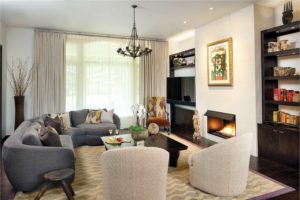
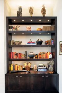
The living room feels modern but not sterile, with lots of natural light and furniture one can sink right into, plus custom shelves.Photography by Tony Valainis
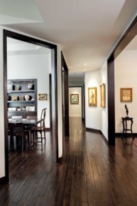
Efficiency and warmth might seem like conflicting goals. But with the Bova team’s guidance, the Gerdisches quickly found that the more they cleaned things up, the more their personality could shine through. As they pared everything back—hiding everyday appliances behind built-ins, doing away with traditional suburban trims and molds, bumping up arched doorways into squares as high as possible—suddenly the place took on a gallery effect perfect for showcasing their art collection. The large, low coffee table stayed the same, its clean, dark lines fitting perfectly into the new approach, but now typically holds just one piece: a Henry Munyaradzi sculpture that Marc and Lori Ann discovered years ago in a gallery on Martha’s Vineyard. On its own, it has even more of an impact. As visitors make their way down the hall, small fixtures spotlight a Marc Chagall here, a Dietz Edzard there, a Jean Picart LeDoux here.
“It was those changes that made a huge difference in order to create a more open concept and create that gallery space right through the center of the house,” says Bova of doing away with the arches and trims. “Now you can see all the way through versus being contained in each room. It was hard to believe it was the same house.”
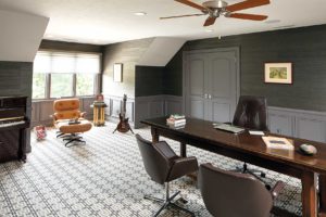
The contemporary vibe softens a bit here and there, like in the ground-floor master suite, with gently billowing bed linens and an antique chandelier whose lines curl defiantly against the clean, straight ones everywhere else. Marc’s upstairs office has a whiff of romanticism, with varying ceiling heights reminiscent of living in a castle turret. Antique French illustrations of doctors at work nod to both his profession and his passion for collecting artwork, as well as his family origins on his mother’s side. They’re a rare carryover from the French Country–style house the Gerdisches once lived in near Chicago, but decided was not for them. “That look can become—I don’t want to say overdone, but heavy-handed, maybe,” says Marc. “We do see a lot of it around Indianapolis. But we loved more contemporary design.”

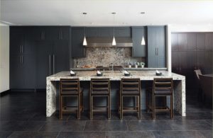
Designer Julie Browning Bova helped the Gerdisches find just the right quartz, cut thickly for the kitchen island.Photography by Tony Valainis
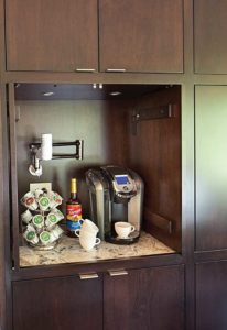
The kitchen is a microcosm of the everything-in-its-place mantra that guided Bova, Baker, and the Gerdisches throughout a years-long redesign process. The refrigerator and other useful things blend right into espresso cabinetry sweeping from the floor up to the ceiling. A coffee nook holding a Keurig and its accoutrements even has a built-in waterline so there’s no need to lug the carafe a few steps away to the sink—and no temptation to leave it sitting out on the Cambria countertop. “That compartmentalization and ability to make everything disappear keeps the contemporary look going,” says Marc, marveling at the home’s “incredibly clean” lines, like in the sleek waterfall island—one of his favorite features. “It’s super functional, and the quartz Julie helped us find has a spectacular amount of motion in it,” says Marc. “It’s almost a piece of artwork.”
Gallery (Photography by Tony Valainis, Styling by Julie Browning Bova):
- Red brick and stone got transformed with white paint, an exterior that still fits right into the neighborhood.
- A traditional suburban house made the leap to modern, earning its spot as the owners’ true home.
- With thoughtful lighting that draws the eye to the Gerdisches’ beloved art collection, the entry hallway takes on a gallery vibe.
- A basic fireplace mantel that had jutted into the living room came down, removing visual clutter along with the keys and knick-knacks it attracted. The Joan Miró hanging above it shines more now, anyway.
- The living room feels modern but not sterile, with lots of natural light and furniture one can sink right into, plus custom shelves.
- Custom shelves in the living room hold collectibles and rare books.
- Designer Julie Browning Bova helped the Gerdisches find just the right quartz, cut thickly for the kitchen island.
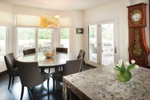
- A breakfast nook holds a generously sized table.
- A coffee station within the breakfast nook.
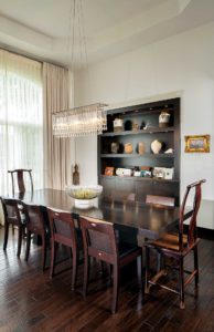
- More art and a stunning light fixture add interest to the dining room.
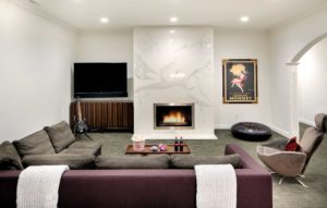
- A basement rec room echoes the elegant living room upstairs.
- Marc’s office is businesslike, but with a touch of romance, like working in a turret.
- The master bedroom has the most relaxed lines in the home.
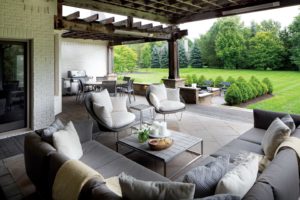
- The back patio keeps the contemporary feel going, which, notes Julie Browning Bova, “really makes the landscape pop.”


