Home Of The Month: Williams Creek

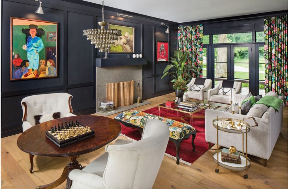
Caryn O’Sullivan does not care what people think of her black living room walls. She is the first to admit the style of her 4,000-square-foot house is eccentric, especially for posh Williams Creek. So what if an antique box spring hangs in the hearth room? Or bunny wallpaper lines a hallway, or a floor lamp sits on a cabinet as a design twist? The textures, colors, arrangements, and collections follow Caryn’s No. 1—and perhaps only—decorating rule: that they bring her joy.
Take, for example, the painting of a man in blue pajamas whom Caryn affectionately calls “Pablo.” He came from a garage sale on 42nd and Broadway. “It was just rolled up,” she says. “I wish I knew the artist’s name.” It probably wasn’t Pablo. “I was reading a book about Pablo Escobar at the time,” she explains.
Nearly every item has a story. The Art Deco chandelier in the living room is from a Paris flea market that Caryn and her husband, Dan, visited on their 10th anniversary. But Caryn’s confident, quirky taste is fascinating on its own. Pablo joins two other paintings in the living room—one of a cow, from Gary Johnson of Surroundings antiques shop in SoBro, and one of Jackie O, purchased at a fundraiser for Noble of Indiana. They’re colorful, curious, and just as eye-catching as the ebony, dragon-patterned fabric complementing the black walls. Caryn has perhaps the best eye in town for window treatments. She owns Drapery Street, a Carmel boutique that specializes in dressing up windows with a range of high-end coverings. At home, Caryn has incorporated the gamut—couture wallpaper from Kelly Wearstler, a motorized roller shade over the kitchen sink that automatically rises and lowers, and neutral-colored outdoor curtains in the new courtyard gazebo. She has a soft spot for textiles by Schumacher. According to her, the luxury fabric company gets color saturation better than anyone.
The O’Sullivans moved into the midcentury California ranch in 2011 and started renovating in 2015. They decided against adding a second story—no one would use it once their two teenage sons went off to college, because the master is on the first level. Instead, they gave the home’s low-to-the-ground profile more presence. “The whole house had eight-foot ceilings,” says Caryn. “Now, the front-door area has a 12-foot arched entry.” It gives the home a stately, but not overly opulent, look.
They also put a lot of thought into making sure the home fosters togetherness—which is harder than it sounds. The house is wrapped around a courtyard with a pool. Three bedrooms occupy the south wing, and a fourth bedroom, along with the kitchen, hearth room, and office, comprise the north wing, with the living room in the center of the house. The couple turned the fourth bedroom into a hangout for the boys and their friends, stealing space from the office to make it bigger. Caryn conducted some market research by asking her sons what they do when their friends are over. She discovered that playing video games these days means having separate TVs and sometimes taking your own TV with you. The room needed to be flexible.

The O’Sullivans love that they can see into the main areas of the house from the gazebo so they feel connected even when they aren’t in the same room.
They also thought about making sure the view from the pool—which sits in a courtyard with the house wrapped around three sides—into the house remained clear, so “you have a sense of where the family is” from that area, Caryn says. As a result, parents entertain in the living room while the boys have their own space, and they naturally meet up in the kitchen and pool area between those rooms.
Another dramatic change was the gazebo. Before its construction, the courtyard was open, exposed to the elements. Caryn used it often because she could see into the living room, the hearth room, and the bedroom hallway. Because it was a favorite spot, they extended the roof over the area to make the courtyard usable most of the year. “I especially love being out there when it’s raining,” she says. “You can sit there and watch all the activities in the house.” Turn on the outdoor heater and close the drapes, and the gazebo becomes a heated tent.
Inside, though, things got a little tricky. Caryn knew she wanted the four-bedroom, three-bath home to reflect her family, their travels, and their trinkets. But what was the best way to incorporate her mother’s antique recipe tins into a sleek, minimalist kitchen? And what about the cowhide pillows she found 20 years ago for $1? Or the bunny wallpaper? Enter experts Marika Klemm of Marika Designs and Angie Wilson of Interior Design Therapy. The pair worked with Caryn to create and curate a modern home with antique touches—a blend of bold and old. For those wondering why Caryn hired design assistance, she offers this piece of advice: “Your home is one of your biggest assets. Use advisers and use the best talent to add some longevity to your investment. Just because you hire a designer doesn’t mean you don’t have style or personality.”
It’s obvious that Caryn has plenty of both. She has an eye for quirky wall coverings and a love of high-contrast colors. And antiques that once belonged to her mother or mother’s friends have found their way onto bookshelves and tabletops. Collectively, the accessories offer an adventure through time and travel. But independently, each item provides a story and a sense of happiness for Caryn. Like a velvet painting of Elvis and the tintype of a woman who looks like Bob Hope. “Doesn’t that bring you joy?” she says.


