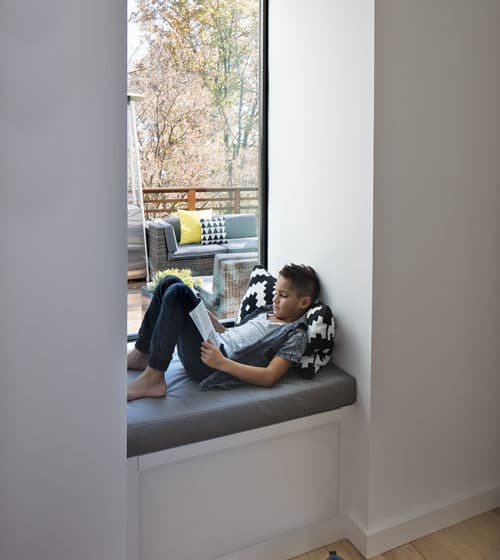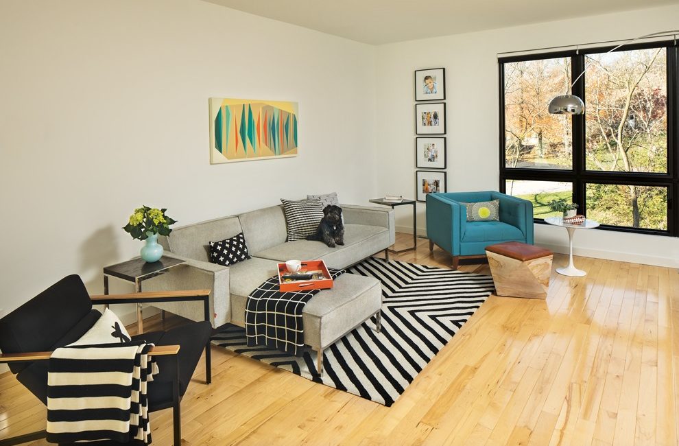
Architect Jason Wolfe placed the home at an angle on the lot so no window in the main living area is exposed to another home, removing the need for privacy coverings.
Home Of The Month: Light Box

The couple worked on the plans with Jason Wolfe of Demerly Architects. A company called UBuildIt helped with the initial stages of building and left the rest (getting permits, hiring subcontractors) to the Sangars. “It laid almost all the responsibility on us, but we saved a lot of money,” Jamie says. The arrangement also meant the family could move in sooner.
Though the Sangars had no experience in building a home, they did have one trick up their sleeves. While most homeowners might struggle to explain their vision to a contractor, Jamie and Simon are both artists—Jamie a photographer and Simon a visual-effects supervisor. Simon was able to create a 3-D rendering of exactly what they wanted their home to look like: a white box with the simplicity, practicality, and incorporation of nature that are key to midcentury-modern design. “It’s smart,” says Simon. “I’m all about having what you need, and not more than you need.”
Wolfe’s original design came in $180,000 over budget, but he brought the cost down significantly by cutting around 500 square feet, a rooftop deck over the garage, and the holy grail of midcentury-modern floor plans: a sunken living room.

The kitchen opens on to the dining room.
You’d never miss these things with so much thoughtful design remaining. Wolfe placed the home at an angle on the lot so no window in the main living area is exposed to the street or another home, removing the need for privacy coverings and instead taking full advantage of the grand display of trees, or, in winter, a clear view of the reservoir, even though the home isn’t waterfront. The Sangars praise Wolfe’s creative use of materials to achieve design interest on their budget. For instance, the exterior paneling is a common product, but Wolfe set the “reveal” (how much of each panel shows when they overlap) at different heights on each side of the house. The effect is a subtle graphic twist: The paneling looks wider on one side than the other. He also found a way to use a typical aluminum product on the corners to create a crisper edge than normally achieved with heavy trim, making the home’s profile sharper.
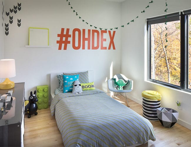
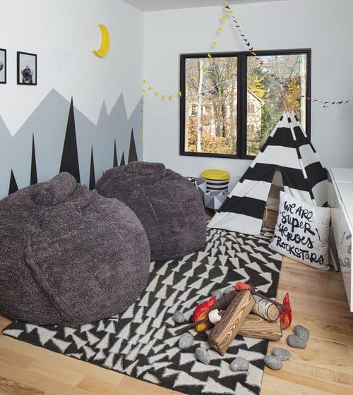
Built into a hill, the house stands a full three floors on one side and two-and-a-half on the other. The front door sits between these sections, or “volumes,” in design parlance. The three-story “volume” to the right of the door stacks a garage, Jamie’s photography studio on the main level, and a third-floor master. On the other side are an above-grade basement with a full guest suite; a main-level living room, kitchen, and dining room; and third-story kids’ bedrooms. The top floor has a water view in the winter.

Architect Jason Wolfe placed the home at an angle on the lot so no window in the main living area is exposed to another home, removing the need for privacy coverings.
The Sangars wanted to go green where they could, opting for pricier yet energy-efficient structural insulated panels, aka SIPs. These panels, fabricated locally by Thermocore, take the place of wood framing on the exterior. SIPs speed up the building process because they are faster to install than traditional framing; builders put up each level in about a day. The interior has standard drywall, but the prefab approach to the exterior helps avoid weather delays. It also leaves less room for human error, because a computer cuts windows and other openings. One catch is that conduits and sockets for writing have to be precut into the panels, too, so you should know exactly where your TV will go even before your walls are up. Installers added 2x4s for extra support where the Sangars planned to hang heavy items, which eliminated the need for pesky wall anchors.
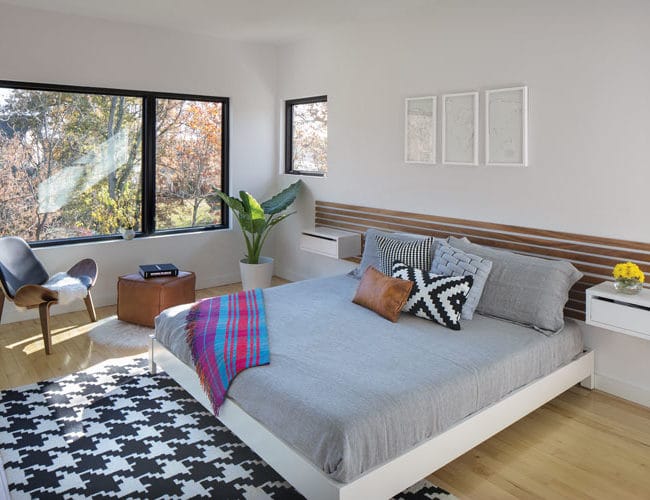
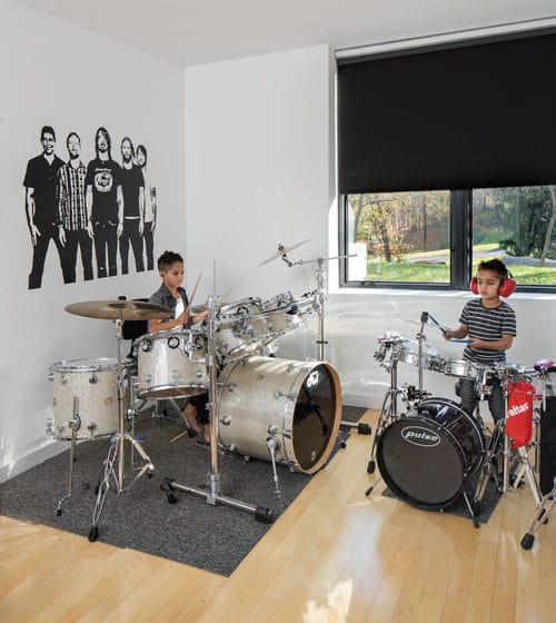
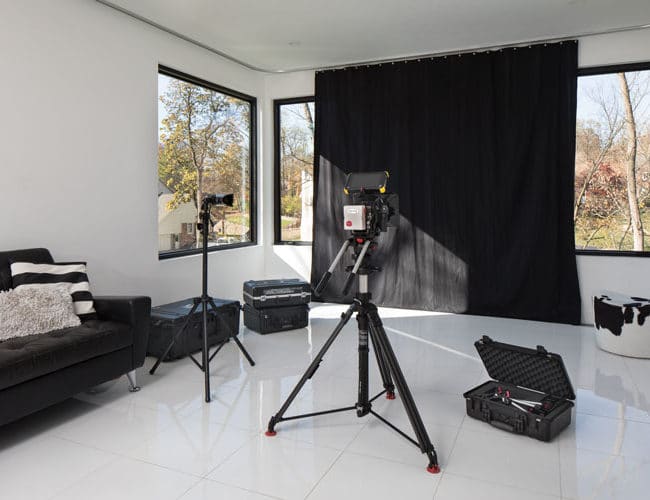
Less than 4,000 square feet for a family of four sounds tight, and it’s smaller than most houses in the neighborhood, but the four-bedroom, four-bath home lives big thanks to space-efficient design (pocket doors, hidden storage), plus an abundance of natural light and a neutral palette. Jamie’s photography studio is fitted with floor-to-ceiling curtains hung on a hospital track and a floor of white tiles, making it a multipurpose space. The curtains close to create a backdrop for photography. The boys hit tennis balls into a contraption with a ball launcher and 8-foot-tall net, and their rackets have a device that displays data about their strokes on a TV.
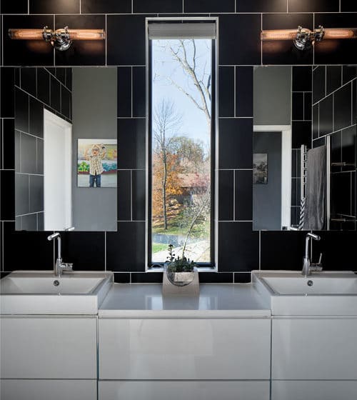
Elsewhere, midcentury-modern influences dominate. Simon admires the way legendary designers Charles and Ray Eames used common materials to achieve a sleek, modern look. You won’t find exotic finishes in custom shapes in the Sangar home. Windows were designed in stock sizes, and every interior and exterior material is pretty easy to find.
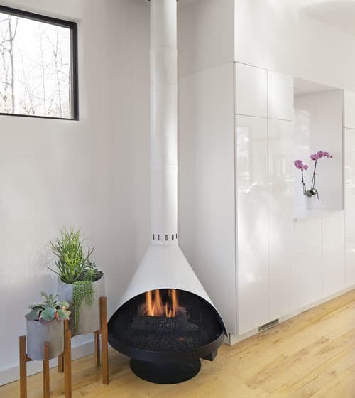
For the Sangars, Modernism doesn’t mean filling their home to the brim with Saarinen and Noguchi. Because they aren’t hung up on collecting high-end pieces, they were able to achieve a modern look within a budget, chiefly with an Ikea kitchen and flooring from Home Depot. That’s not to say they never splurged. The couple spent some of their DIY savings on Sub-Zero and Monogram commercial-grade kitchen appliances and a Control4 smart-home system that automates solar shades, the garage door, the fireplace, lighting, the television, appliances, and other features of the house. Who would choose yawning square footage over supreme functionality like that?

