Modern Marvel in Chatham Arch
Some Chatham Arch residents may think the home looks like an alien ship landed in the middle of their neighborhood.
Situated between a bright-blue, three-story Arts and Crafts home and a more demure forest-green-and-brick Prairie-style residence, Pete and Sarah Welsh’s narrow, rectangular abode is certainly unexpected. It pulls certain themes from the surrounding neighborhood—brick columns, a flat roof, the small front porch—but it is decidedly more contemporary than anything else on the block.
Artistic Vision
The ultra-modern home smack dab in the middle of downtown was Pete’s dream. He came to Indy via Chicago in 2011, and when he and Sarah first started looking at homes together in 2012, Pete wanted something that captured the vibrant city vibe. His vision was a glass house featuring concrete and steel near downtown, and when they couldn’t find that, they decided to build their own. After spending more time searching for the architect that would turn their dream home into a reality, they found One 10 Studio, which worked as both architects and builders on the project, a convenience that made the whole process seamless but is a service One 10 rarely offers anymore.
“Pete was from Chicago, and he was looking for something that was unique, maybe not to Chicago or the West Coast, but something that was unique to Indianapolis,” says Patrick Kestner, project manager and associate at One 10 Studio. “He wanted very contemporary urban design—something he was specifically looking for and we were specifically looking for.”
But putting together a super-sleek, modern house wasn’t as simple as dreaming up the design and putting pen to paper. Before construction began, the plans had to be approved by multiple committees. Since Chatham Arch is a designated historic preservation district within the jurisdiction of the Indianapolis Historic Preservation Commission, they had to show the plans to the Chatham Arch Neighborhood Association twice and also get approval from the IHPC.

The Welshes wanted a staircase with no railing. Unfortunately, building codes require a barrier above certain heights, so they settled on a glass wall instead.
“The first time went as you would probably imagine,” says Clete Kunce, principal and founder of One 10 Studio. “It was, Why doesn’t this look like a house? And so we went through that whole process.”
“People still don’t think it’s a home,” Sarah says with a laugh. She says guests seem surprised the first time they visit, and taxi drivers pull up with a look of skepticism on their faces. But upon entering the home, you realize it is much more than sharp angles and steel beams.
Creating the Framework
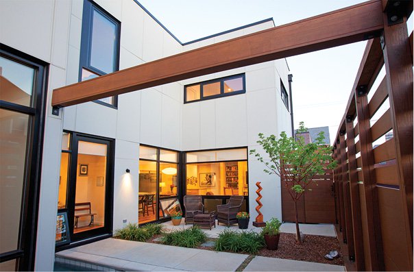
The front door opens not into an entryway or a living room, but a lush courtyard featuring outdoor lounge chairs where Sarah likes to relax on warm summer days and an L-shaped plunge pool where Pete cools off after runs. The simple oasis is protected from ogling eyes by a six-foot wooden fence. Of course, the slats run horizontally instead of vertically like your typical fence. Nothing about this home is traditional.
From the courtyard, you can see the living room, dining, and kitchen areas through industrial-grade glass walls, which were a unique challenge for the architects.
“Pete wanted glass, steel, and concrete,” Kunce says. “And how do you get glass and light into that space without feeling like you’re in a fishbowl? That’s when I came up with that courtyard entry.”
The glass keeps noise from the nearby interstate to a barely audible whisper, and once inside, the space feels much homier than you might expect from such a sleek exterior. Oak floors made from reclaimed barn wood, old Turkish rugs, and brick accents warm the space, and the couple’s friendly dogs, Guinness and Dylan, erase any nagging feeling that you’re in an architect’s conceptual dream.
Finishing Touches

If the kitchen seems small, that’s because it is. Space is a commodity downtown, and the Welshes chose to create spacious living spaces instead.
The space has a wide-open layout, so it was important to Sarah and Pete that the entire interior design flowed from one room to the next. Since the kitchen is the center of the home, they decided to start there. After Sarah found and fell in love with their quartz countertop, they dragged it around for months picking out hardware, furniture, and cabinetry that matched. A large, minimalist print hangs adjacent to the dining table.
“That’s a Robert Motherwell from his 1971 exhibit,” Pete says. “That was one of our splurges.”
Art plays a prominent role in the home, and you can find it on almost every wall in the house.
“When we started working on the interior, we said, Let’s make it like an art museum,” Sarah says.
She graduated from Herron School of Art and Design with a BFA in drawing and design, and, for a time, worked as a freelance graphic designer. One wall of their living room—the “Herron Wall”—features pieces by artists that Sarah either studied with or learned from at the school: Kim Fuelling, Richard Emery Nickolson, Anne Nickolson, Matt Eickhoff, Peg Fierke, Erturk Mehmet, and Michael Vaughn.
The rest of the home’s walls are peppered with a plethora of local artists and a few pieces from their travels. One of the last paintings local artist Susan Hodgin finished before she passed away in August 2014 hangs above their fireplace. A small Kate Oberreich painting of paper airplanes that Sarah commissioned to commemorate Pete reaching 1 million frequent flier miles hangs on a kitchen wall, and a Johnny McKee painting of their house was Pete’s gift to Sarah on their first anniversary.
The master bedroom is simple and relaxing with just enough room for a king bed and more art. The sliding pocket door between the bedroom and bathroom underlines the emphasis on the architechts place on functionality. In the
master bathroom, a limestone shower is a little piece of Indiana, although, ironically, they couldn’t source any limestone from the state. And outside is another shower Pete likes to use during warmer seasons.
“I don’t get it,” Sarah says with a laugh. “But a lot of men we show it to are like, Oh yeah! That’d be awesome!”
On Display
To get upstairs, you must use the floating staircase, the striking visual zenith of the home. A glass wall eliminates the need for a railing, and the vaulted ceiling doesn’t hide the cool ash stairs as they ascend to the top floor. That’s where you’ll find a cozy loft area, the spare bedroom and bathroom, and a rooftop patio. A screened-in porch with a hammock is connected to the patio for rainy or buggy days. The patio’s spacious floor plan and uninhibited view of the skyline make it an ideal spot for summer parties. The privacy the space offers is hard to imagine for a home right on a busy intersection downtown.
“It’s a surprisingly great house for entertaining people,” Sarah says.
So great, in fact, that after the home was completed, they hosted a Buddhist house-blessing with more than 60 of their friends in attendance, and Pete and Sarah were actually married in their living room.
The front of the home is narrow, and although the interior doesn’t immediately feel like a large home, it just keeps going and going. Smart design and planning made that possible, and Sarah and Pete have curated a cozy yet bright and airy space within the walls of their glass home.
“It’s an amazingly livable house,” Pete says.

This article appeared in Indianapolis Monthly Home, a 2016 special publication.


