This Three-Bedroom Home Looks Straight-Up Gorgeous

This new three-bedroom home maximizes the narrowest of lots.Photo by Tony Valainis
A common misconception about Brandon Bart and Tyler Knox’s three-story home in Indy’s Hillside neighborhood, just east of Kennedy-King and the Monon Trail, is that it’s prefabricated or made from a shipping container. In fact, the custom design was built from the ground up for two real estate pros who knew what they wanted: a fuss-free, function-first approach to modern design. In Indy, homes with these shapes and styles started popping up several years ago, especially in Fountain Square and other revitalized neighborhoods close to downtown. But while all modern homes are contemporary, not all contemporary homes are modern.
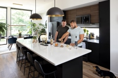
“Just because something is boxy and doesn’t have traditional detailing doesn’t make it modern,” says James Poisel, the local architectural designer behind the home, which was completed in 2019 by The Re-Development Group. “Modernism is an art form, like how impressionism is a style of painting.” Poisel cites Ludwig Mies van der Rohe, a German architect who popularized the phrase “less is more,” as one of his influences. It’s easy to see, too, when you look at Bart and Knox’s home—the rectangular shape. No extravagant trim. Huge windows that provide transparency and connect the indoors to the outdoors. “A lot of people say it looks like a West Coast house,” says Bart, a development manager at homebuilder Onyx + East, known for its neighborhood-infill projects near downtown. Knox, his fiancé, also works in the industry, as a development manager at The Annex Group. Because of their professional experience, the couple found the idea of hiring a designer intriguing, not intimidating. They saw a Re-Development Group house they loved in Fountain Square and asked who designed it; it was Poisel’s own residence and work. “My favorite part about building our own home was choosing an architect based on our style,” says Bart. “We didn’t have to go with a standard floor plan that a builder is going to use and repeat everywhere.” A “typical” plan probably wouldn’t have fit on their lot, anyway; it’s so narrow that Bart and Knox’s home is just 18 feet wide. (There are Chevy Silverados longer than that.) Looks can be deceiving, though.
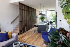
Although it’s narrow, the 1,750-square-foot home has three bedrooms and three bathrooms. A wooden brise-soleil on the front provides some sun protection and adds visual depth. The exposed concrete garage faces the street, since the alley behind the home hasn’t been improved. While a one-car garage might be a deal-breaker for some, it’s perfect for Bart and Knox, who both work nearby and share a vehicle (Knox typically bikes his way around). Also on the ground floor: a one-bedroom Airbnb with a private entrance. The rental, dubbed Indy Mod Pod, has its own Instagram account and was always part of the home’s design. While it does provide the couple with secondary income, the Airbnb also reflects two of their values: hospitality and travel. Like Bart and Knox’s upcoming destination wedding in Iceland, for example. Or their designation as Airbnb Superhosts. But the couple also enjoys inviting family and friends over for holiday get-togethers, low-key weekday dinners, and all-day Indy Pride celebrations. Depending on the month, you may see “Indy’s Largest Pride Flag,” a spiderweb stretched across two-thirds of the front façade, or a 12-foot Christmas tree. (For Knox, it just wouldn’t be the holidays without a tree that just touched the 12-foot living room ceiling.)
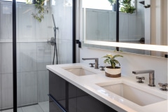
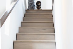
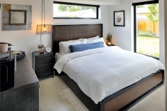
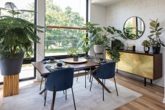
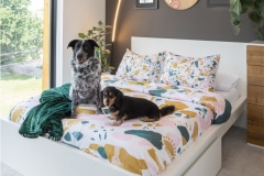
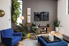
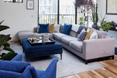
The day-to-day decor might not be as festive, but nor is it a palette of serious neutrals that many associate with modern design. Royal-blue upholstery, a wooden entertainment center, a large cozy rug, and plants offset any architectural austerity. In the dining room, an AllModern credenza with gold doors plays off the dining room’s Art Deco-inspired wallpaper from Wayfair. “Gold and black are our go-to colors because they are the only ones we agree on,” says Bart, laughing. “Besides that, I don’t like color.” Which might be the reason Bart’s favorite part of the house is the master bathroom—when it comes to the materials, fixtures, and color palette, it resembles a luxury hotel. Knox’s favorite room is more colorful, however. The third-floor guest room, known informally as “the girls’ room” (for the couple’s two dogs), includes an unobstructed view of the neighborhood and a covetable work-from-home corner. The bedspread also catches the eye. It’s an unexpected pattern in a home designed around straight lines and simplicity. But that’s what makes design interesting—it’s unpredictable, constantly evolving.
The ground level houses an Airbnb space. The owners live on the upper floors, where the custom design allows for large windows—including one taking the place of the kitchen’s backsplash.

