Wide Open Spaces
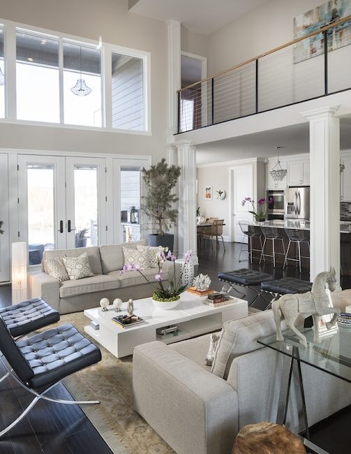
The two-story entryway of Dani and Andre Kohl’s Zionsville home is impressive yet inviting. The space, bracketed by an open floor plan and huge windows, feels more like the lobby of a palatial retreat than the centralized living area for a family of four.
“We can watch TV in the family area and still play a board game with the kids in the center of the house,” Dani says. “We are very hands-on parents, and we wanted an efficient space where everyone can feel close.”
The secret is all in the planning. When the couple found the lot in the Stonegate neighborhood that would someday be home to their young family, they knew it was important to consider the interiors as well as the exteriors, lifestyle as well as the floorplan, and the future as well as the present. Such a task was familiar to Dani, an architect and owner of Kohl Interiors, an interior-design company.
“We knew that we wanted a lot of windows to let in natural light and bring the outdoors in,” Dani says. “But as an architect as well as an interior designer, I also thought about where the TV would go, where the fireplace would be, what furniture elements would be in the room, and how our lifestyle would fit into the space.
“We’ve been in the house for six months now, and looking back on it, we wouldn’t do anything different.”
Fuss-Free Interior

With this setup, everyone can see each other, which was the goal.
“We wanted a floorplan that would integrate the whole house so that everyone could interact, rather than having a bunch of little rooms that felt like cubicles,” Dani says.
The couple also likes to entertain, so they needed plenty of room for family and friends. On any given evening, the Kohls may have guests lingering over coffee in the dining area in the front of the house while the kids play in the basement. Or, they might gather around the massive 5-foot-by-10-foot kitchen island that features a seamless slab of solid white marble.

Crystal chandeliers over the island add some glamour, and though it’s a big space, Dani says it still feels cozy.
The house is filled with a number of interesting touches that give the space complementary contrast. Modern hardware is juxtaposed against the office’s barn doors, which Dani custom designed, and also the wooden beams of the ceiling. Sleek furnishings are accented with accessories purchased while traveling overseas. Colorful artwork and live plants pop out against the neutral hues, and warm textures soften what could have been a cold, stark space.
“To me, texture is luxury, and I incorporate it wherever I can,” says Dani, also the director of the interior-design program at the Art Institute of Indianapolis.
Separate Yet Together

The master suite is comprised of the bedroom, the bathroom, the closet, and the laundry room, which can also be accessed through the hallway. Once again, the Kohls opted for clean lines and a consistent look without overt repetition.
“I love patterns and textures and consistency, but not everything has to match,” Dani says. “That’s why you’ll notice the lamps are both crystal but two different styles. The nightstands coordinate, but they are two different pieces.”
Across the stainless-steel cabled mezzanine is the kids’ wing. Instead of choosing character-laden decor, Dani opted for neutral palettes that would allow them to transform the space as they age. In their previous home, the couple’s children shared a Jack-and-Jill bathroom, but in this new abode, they thought each child needed his and her individual space.
“They are young now, but we aren’t planning to move from this house any time soon,” says Dani, “and we wanted something that would grow with them and give them a little bit of privacy. My son’s bathroom is more masculine, and my daughter’s is more feminine and has a bigger closet—which my son says is unfair—but she is a girl, and we’re thinking of future needs, as well.”
Planning Pays Off

One thing that made the whole process a lot easier is that both Dani and Andre were on the same page about what they wanted in their home. Andre, who works at Allison Transmission, says his colleagues told him that building a house together would be difficult because each would have their own tastes. As it turned out, that wasn’t the case.
“There were a lot of decisions to be made, and we were constantly hunched over our iPads choosing things,” Andre says. “But we both knew that we wanted a house that was integrated, uncluttered, and would fit into our lifestyle needs.”
By taking the time to plan everything out during the pre-design phase, they were able to make use of items they already had and feel confident that the house would suit them perfectly once they moved in.
“In so many cases, people work with an architect and then hire a designer when they can’t figure out how to make it all work,” Dani says. “By that point, it’s too late, but taking the time to plan makes all the difference. There’s always a lot of stress when you are building a house, but all in all, we had a great experience, and we love it here.”
Photos by Tony Valainis
This article originally appeared in the Home 2014 issue.


