Home Of The Month: Old Soul
Designer Jodi Golm laughs when asked about the inspiration for her home’s color palette. It can be traced back to a simple fashion accessory. “It was a scarf that pulled it all together,” she says. “I knew what colors I wanted, and as I was designing each room, I realized that everything I wanted to have in the house was in this scarf.” There were the hues: black, white, gray, taupe. There was the plaid pattern. And then there was the woolly texture, the natural fibers. “It sounds ridiculous, but the scarf was my sounding board as I made choices,” says Golm, whose company, Manse & Moss Design, specializes in interiors and brand development. “I kept it with me when choosing tile, flooring, paint, etc.”
All of those hues and finishes feature prominently in the space she shares with her husband and two daughters in Northeast Indiana. But it’s no cookie-cutter farmhouse. Rather, the three-level residence marries the trendy with the traditional.
In 2016, after struggling to find a home that met their needs, the family partnered with Fort Wayne–based architecture firm Martin Riley. “Building was a last resort for us,” Golm says, “but after going through our wish list, it was clear we needed to build.” One by one, the inspirational images and items Golm had been collecting for more than a decade were incorporated into the design. In 2018, the family moved into their five-bedroom, five-bath dream home, where it seems that everything old is new again—and vice versa.

Homeowner and designer Jodi Golm frequents big antiques markets in Round Top, Texas, and elsewhere.Tony Valainis
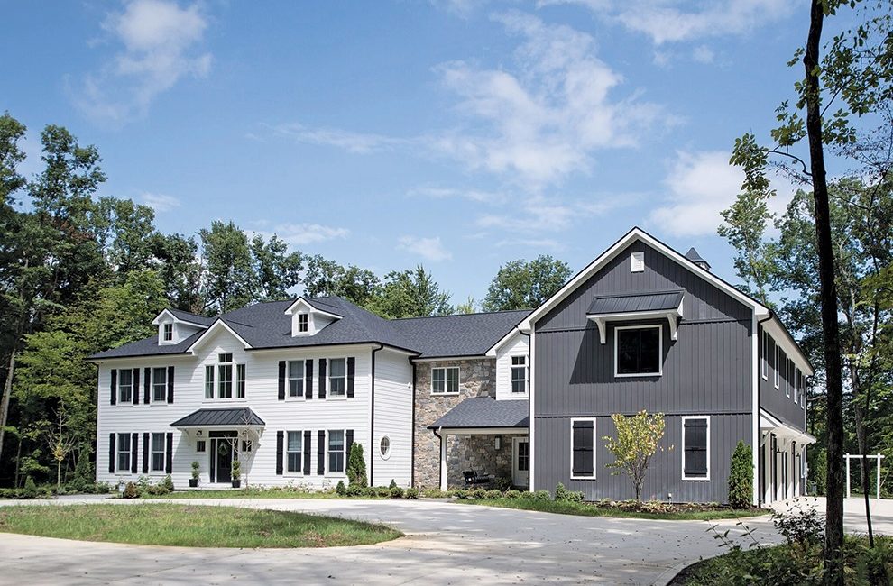
From the outside, it’s hard to believe the home is less than two years old. Its symmetrical facade is typical to Georgian Revival architecture, which gained momentum in the late 1800s. Siding resembling the texture and heft of real wood also gives the home historic vibes. It’s a simple yet stately look. “My husband and I wanted something that made people wonder, Is that an old house?” Golm says. Contributing to the home’s agrarian feel is a section that Golm calls the “barn.” It includes a four-car garage, a playroom, a pool cabana, and a trophy room, and connects to the main living quarters both upstairs and down. Golm talked her husband out of a detached building for his trophy room in favor of this attached version, which has a playroom on the upper level. “It optimizes the space above the garages and keeps us connected,” she says. “Now he has a roomy balcony that he otherwise would not have to enjoy the country views.” Its barn-like appearance and charcoal exterior also hint—not so subtly—at the interior’s wholly neutral palette.
Which is where that scarf comes back into play. It inspired the plaid tile in the powder-room bathroom. Burlap lampshades for the great room. A black butler’s pantry. And weathered wood ceilings. Nearly everything in the home matches the scarf, or leads visitors to ask, “Is it new or is it old?”

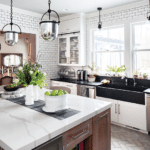
The new Georgian-style home joins traditional architecture with trendy dark exteriors. Inside, a European-farmhouse look reigns. In the kitchen the finish on the island and corbels matches that of 150-year-old sliding doors in the great room.Tony Valainis
Take, for example, the kitchen’s range hood. It appears to be zinc, but it’s actually wood. The secret? Golm hired Fort Wayne’s Martin Interiors to detail the hood for 1/10th the price of a zinc version. Martin also created a custom stain for the sliding barn doors in the great room and for the pantry door. “They really made the difference,” Golm says of the company. “You can always tell the difference between a great paint job and a poor one.”
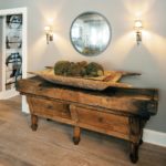
While the range hood is a new fixture disguised as an old one, there are plenty of antiques, too. Golm finds most of her picks in antiques mecca Round Top, Texas. There, she picked up century-old corbels for the dining room and kitchen, and the sliding barn doors, more than 150 years old. A Belgian butcher block gets the honor of being the oldest piece in the house. It serves as the sideboard in the dining room, and at 250 years old, it is “entirely wonky,” Golm says, with hatchet marks and a top worn into a dip from the weight of animals.
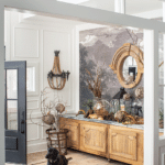
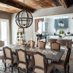
Antique or otherwise, everything—and every room—has a purpose. Take bunk rooms, for instance. They’ve gained momentum in new homes after popping up a few years ago. The four-bed bunk room at the Golms’, used for sleepovers and out-of-town guests, has an extra touch of magic, though: It’s accessed through a hidden door behind a bookcase. A secret knock is required to get in. The butler’s pantry aids with entertaining, used as a staging area for large gatherings and a place to store Golm’s dish collection. What sets hers apart, though, is the black cabinetry, black subway tile, and black-and-white wallpaper from Magnolia Homes. “In smaller spaces, you can be a little more bold,” Golm explains. “I wanted to find those moments for drama.” Like in the entryway, which sports a nature-inspired mural from Anthropologie. Or in the dining room, where the ceiling comprises salvaged wood from an Indiana barn. Each feature, while eye-catching in its own right, relates back to the home’s cozy yet contemporary palette. It may just take a moment to determine if what you’re looking at is new or old.
Gallery (Photography by Tony Valainis):
- The new Georgian-style home joins traditional architecture with trendy dark exteriors.
- The entry’s French oak cabinet is an antique.
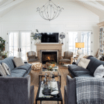
- The living room of this designer’s modern farmhouse.
- In the kitchen, the finish on the island and corbels matches that of 150-year-old slding doors in the great room.
- The butler’s pantry.
- The dining room.
- A buffet table in the dining room.
- The triple sink laundry room.
- The children’s bathroom with their initials in tile on the floor.
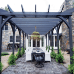
- Dining under the pergola.


