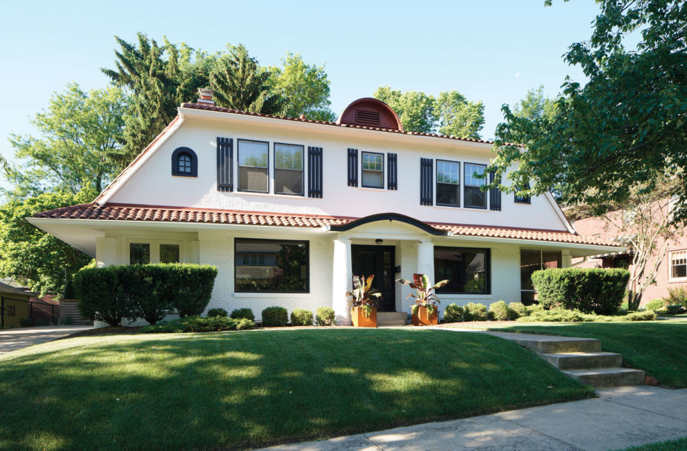
Our Favorite Houses: Balanced Beauty

Owners Josh Cox and Jonathan Scott haven’t found an explanation for why their 1922 Dutch Colonial has Spanish tiles—and there isn’t another house like it nearby that might offer breadcrumbs in this architectural mystery. Nevertheless, the home’s charming symmetry was the start of their instant bond with it. Only the third house these first-time homebuyers saw, they made an offer within two days.
Inside Story
The symmetry continues inside. The main level has a semi-open linear floor plan. The entry is flanked by mirror-image spaces—on one side, a living room continues into an airy media room, ringed with windows, and on the other side, the dining room flows into a screened-in lanai the same size as the media room. Wide doorways and French doors allow for a view across all four spaces. The living and dining room each have a picture window overlooking the front yard and another facing the backyard, creating more dramatic sightlines. Upstairs, the original master bedroom spans the entire width of the home. Walk-in closets have a small arched window, which might have been intended to attract moths to the light and away from clothes.
- Mediterranean charm outside, flooded with light and serene symmetry inside.


