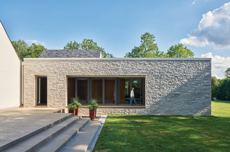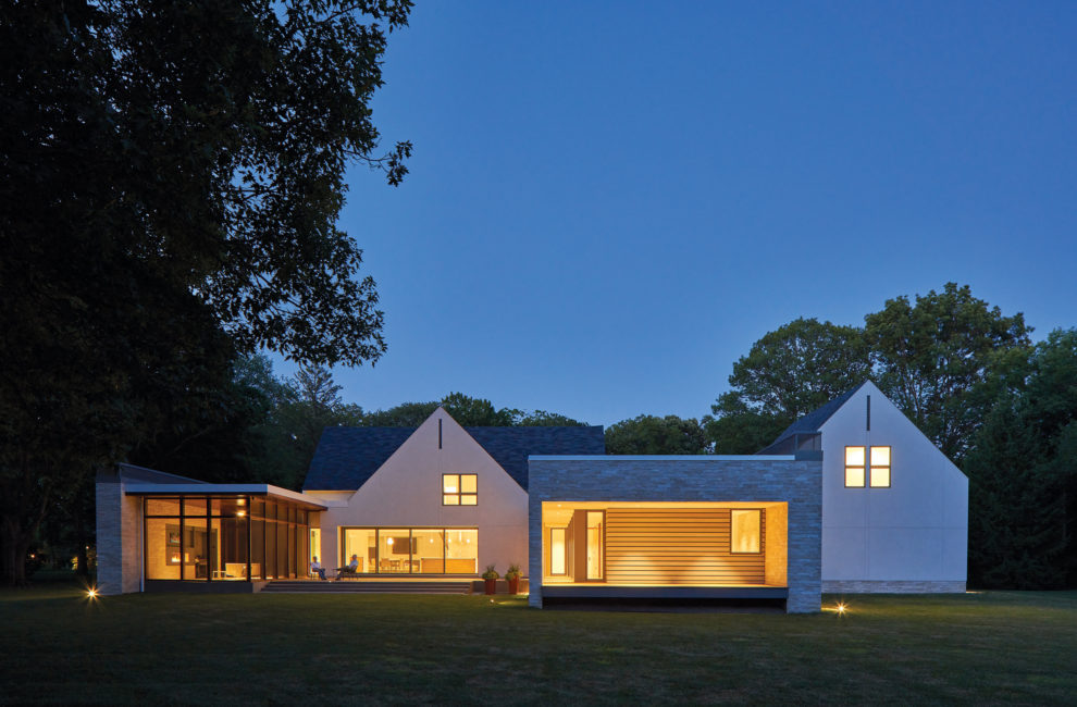
One 10 Studio's additions created a private courtyard with a mahogany screen porch in back of the home. Photos by Keith Isaacs
This Highland-Kessler Home Makes Honor Roll

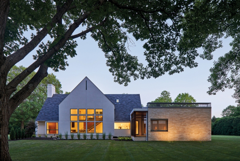
One 10 Studio left the windows and the stairs in their original positions but contemporary detailing gave both a state-of-the-art feel. The stairs open to a spacious area that includes the living, kitchen, and dining rooms, and connect to an upstairs loft where “my wife enjoys longarm quilting,” says one of the owners.
Anyone who has ever built a new home knows that the design and construction process takes time, patience, and creativity. Infusing fresh life into the bones of an existing home is an even greater challenge—it’s about respecting what’s already there. About blending old with new, traditional with contemporary. Which is exactly what one couple—with the help of architecture firm One 10 Studio—did with their head-turning home in a prestigious pocket of distinctively designed houses near Highland Country Club.
The couple, founders of a recycling business, wanted to downsize from their 10,200-square-foot home and simplify. At first, they considered building new. Then they spotted a four-bedroom house for sale in The Indianapolis Star. It had a tired floor plan and needed work, but there was potential in the old-growth trees and Eden-green grass that surrounded the home, which leaned modern. So they started making plans to leave their traditional suburban mansion for a fresh start in a contemporary masterpiece.
James McQuiston, a prominent local architect behind the new Kan-Kan Cinema and Brasserie, designed the home in 1987. Not long after, he received an award for it from the Indiana Chapter of the American Institute of Architects, who appreciated the home’s vertical wood siding and north-facing two-story windows. By today’s standards, though, the living space felt disconnected. Interior walls compartmentalized the kitchen, dining room, and living room, making them feel dark and dated. Plan A was to do a refresh, a little remodeling. But after talking to One 10 Studio, the owners decided on Plan B: strip the home down to its very bones.

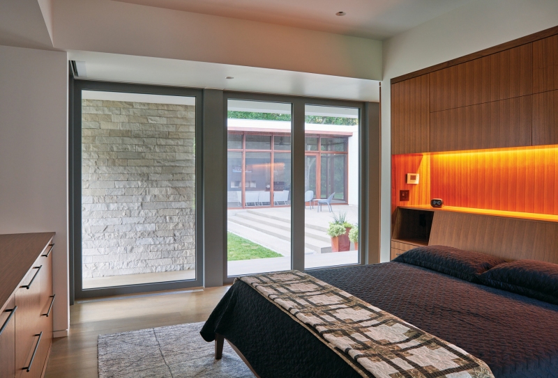
The passage to the home’s primary suite is faced with walnut. Note the lines inside the home and out? “This is kind of my trick everywhere,” says Clete Kunce, One 10’s principal. “My whole thing is horizontal datums. It’s all about the horizon to me. That’s how we sort of make it easier for the everyday guy walking around the block to understand his world.”
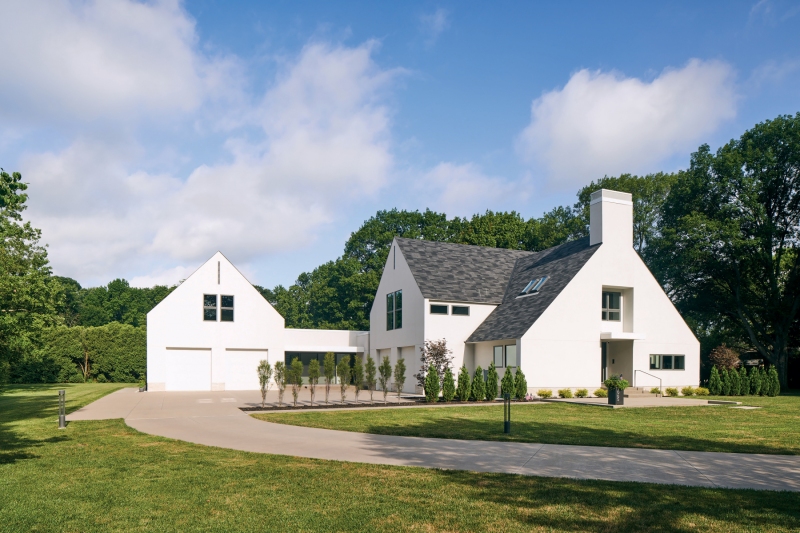
“We pretty much gutted it,” says Clete Kunce, One 10’s principal and founder. “Once we started demo’ing, we found that the outside walls were sitting on face brick that wasn’t all that structural. And the siding was starting to rot and had termites.” Despite being a bit of a Pandora’s box, the project forged on. Stacked-stone wainscoting supplanted the deteriorating brick, and crisp white stucco replaced the the aged wood siding. (Kunce likes to point out that it’s true traditional stucco, which isn’t as prone to water damage as the synthetic version.) While the new materials solved the home’s moisture issue, there was more work to do. The owners wanted their suite on the first floor, an open floor plan, and more windows—if they were going to live on a lot with 100-year-old trees, they wanted to see them.
As a solution, One 10 suggested adding two “bookends” to the home’s cross-shaped layout. One would house a new two-car garage and owners’ suite; the other would add a screened-in porch. Outside, the bookends would flank a private outdoor living space completely sheltered from the neighbors. “Whatever we added, we wanted it to complement, not compete,” says Kunce. “I wanted to pay homage to McQuiston and had this romantic notion that it would be cool to keep the form, but still do our own thing that still suited the owner.” Which is why, even after the square footage doubled, the original gable roof continues to stand out.

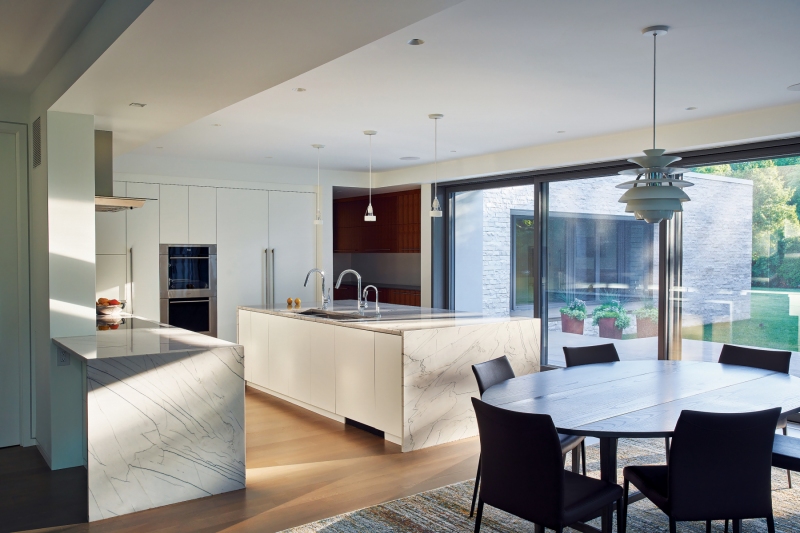
Quartzite is another standout material. The owners worked with Chris Baker of Cathedral Marble and Granite to find a durable countertop material that could literally take the heat from pots and pans. The kitchen island countertop, made from one solid piece of quartzite, weighs thousands of pounds and required the floor to be reinforced.
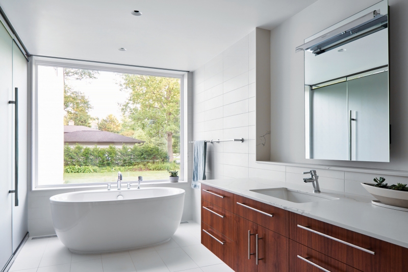
To keep the home from feeling stark, One 10 incorporated white oak floors, gray porcelain tile, and walnut paneling. They also kept hardware to a minimum—doors are touch latch, as are the kitchen cabinets. Even the dishwasher will open with a bump from your hip. Less hardware means fewer chances of accidentally running into a door handle, and it also decreases visual noise. “At this stage of our lives, we do not want clutter,” one owner says. “To truly enjoy living in a modern house, you have to be prepared to be more organized. It’s actually a calming influence after a hectic day.”
Finding the balance between modern and traditional can be tricky. It requires an appreciation for what already exists and a vision to complement it. As Kunce says, you don’t want to overpower what’s there or have one element overshadow the other. When that balance is struck, heads will turn—and contemporaries will notice. The remodel received a second award from Indiana’s American Institute of Architects chapter, 20 years after the original construction did, and was recently honored with a Builder’s Choice Design Award from Builder magazine, given to just 14 homes in the country. The term “bookends” for the additions turned out to be prescient.


