A Feast For The Eyes
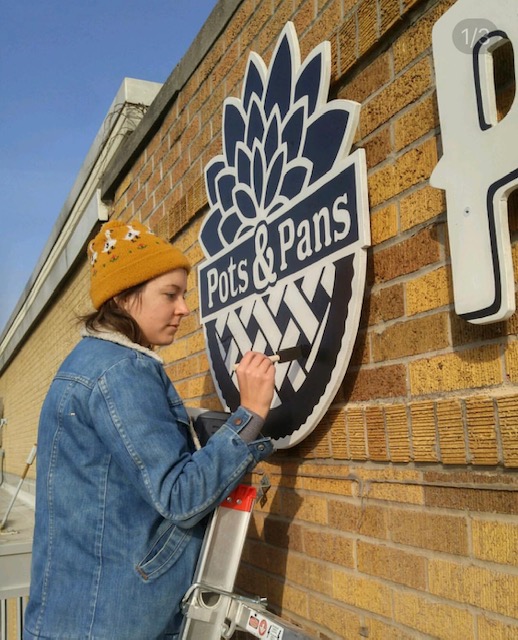
Emily Gabel paints the Pots & Pans Pie Co. sign Courtesy Emily Gabel/Bootleg Signs
If you’re a committed fan of the local Indy food scene, you’ve probably had a meal in the company of Emily Gable without even knowing it. Okay, well, the spirit of Emily Gable, as expressed through her art. Her work is on doors, menus, walls, posters—even roofs—all over Indianapolis, as chefs and restaurateurs enlist her to translate their vibe in full color, for all the city to see.
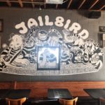
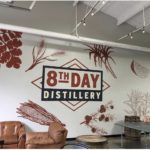
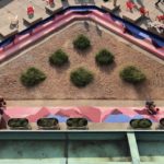
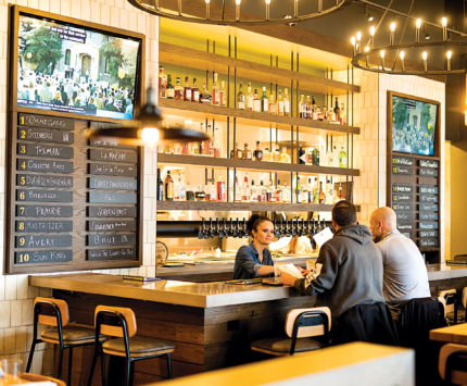
As she puts the finishing touches on her latest painting project, Jailbird—the new bar and restaurant from Thunderbird owner Joshua Gonzales—we realized Gable’s artwork is nearly everywhere we look these days, from the menu planks on the wall at Pots & Pans Pie Co. (Grandma’s house, but make it kitschy and modern), to the roofline of Duke’s (painted industrial metal meets honky-tonk milieu). That mural with Upland Brewing Co.’s signature hills stretching from floor to ceiling at the College Avenue location? Gable. The larger-than-life corn, citrus, and juniper berries along the wall at 8th Day Distillery? Yep, Gable. Even the desert-vibe pink and blue steps outside Indianapolis City Market are hers.
The Herron School of Art & Design graduate launched Bootleg Sign Co. in 2017 and never looked back. She hasn’t had time. “I wanted to find out if I could really make it doing this sign-and-mural business, so I went for it,” says Gable. “It’s been nonstop since I started.”

The entryway to JailbirdSuzanne Krowiak
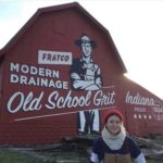
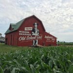
The Peru, Indiana, native got her first job as a working artist right after graduation from Herron with Big Car Collaborative, where she partnered with small communities around Indy to create paint-by-number murals. She took a brief detour into baking at Milktooth, but they parted ways when they both realized she was better with a paintbrush than a pastry brush. As she formulated a plan for her own painting business, she got a gig doing a mural on the side of a big red barn in Flora, where she used an old-school overhead projector to splash the client’s design for an agricultural ad onto the barn, then hand-painted it over the course of two cold and windy weeks in November (while her husband hoisted her thirty-five feet in the air on a scissor lift). From there, the jobs rolled in, one after the other. (She even had a full-circle Milktooth moment earlier this year when they commissioned her to create a poster celebrating the collaboration between the Indy brunch behemoth and Dove’s Luncheonette in Chicago.)
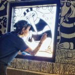
While many of Gable’s clients are in the hospitality industry, you can also find her paintings and murals at other businesses, including eye doctors (Ossip Optometry), barbers (Machos Barber Shop), and marketing agencies (Well Done). Her jobs are a mix of executing designs already completed by the client’s creative team in advance, and original ideas she dreams up as she learns the goals and needs of the business. On the Jailbird project, she painted characters created by graphic designer Aaron Shyr of madkidgenius, while at Duke’s, owner Dustin Boyer gives her creative freedom. “I float an idea out there and say, ‘I’m interested in something along these lines,’” says Boyer, “and then I just let her run away with it.” The Boyer/Gable artistic partnership was forged early, when the aesthetic mood of Duke’s was just beginning to take shape. Boyer had been carrying around an old Western paint-by-numbers drawing for years, thinking he might turn it into a tattoo someday.
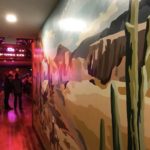
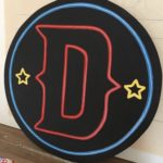
But a long, narrow hallway between the dining room and bathrooms at the restaurant was prime real estate for something visually dramatic, and Boyer thought back to his drawing. He’d heard about Gable’s work on the big red barn through the grapevine, so he tracked her down, talked it over with her, and watched as she spent a week freehand-drawing the Western picture on the wall and then painting it by numbers, exceeding his wildest dreams about bringing it to life. “She’s so creative and detailed,” he says. “It was astonishing to watch.” In addition to the mural, she’s painted several other signs hung throughout the space, including a neon-“looking” sign that isn’t actually neon, and the expansive roof signage, which involved painting five 10-foot-long metal strips in her living room. The freedom she has at Duke’s allows her to channel her love of vintage typography and muted colors (“The grungier, the better,” she says), a style inspired by her love of the late San Francisco street artist Margaret Kilgallen. “She captured everyday people in her own way, and was inspired by a lot of vintage typography and sayings,” says Gable. “She was really good with color, too. Reds, yellows, browns.”
For Gable’s next act, she’d like to move her studio out of her home and into a larger space, giving her more room to work on projects for her growing list of clients. But some things won’t change. “I just see an old grungy garage. Let me fix it up.”
Gallery:
- Interior design of Jailbird by Emily Gable
- 8th Day Distillery wall
- Bootleg Signs designed a western themed painted mural for Duke’s
- A conversation pit outside the City Market painted by Emily Gable of Bootleg Signs
- Duke’s Indy logo by Emily Gable
- Design on window of Jailbird

